Here’s the thing: people don’t always admit it, but brand design does a sneaky job of deciding what ends up in their basket. You can bang on about features, benefits and pricing until you’re blue in the face, but the truth is that visuals usually make the first move. A well-designed brand can signal “trust me” before the customer has read a single word. But how do they do it, you ask? Let’s break it down for you.
We’ve all been there. Wandering through a supermarket – tired, hangry and faced with a wall of near-identical products. Do you stop to carefully read the labels on every single one? Obviously not. You grab the one you are familiar with or the one that speaks to you the most visually. That’s why recognition matters – studies show consumers are around 50% more likely to buy from a brand they recognise.
One thing we find absolutely mad here at Noramble is the cheese aisle. It’s a sea of beige packs, faint tartan patterns and the occasional block screaming “Mature Cheddar” like that’s meant to be exciting. Everything looks the same, nothing stands out, and frankly, the whole aisle is begging for a brand to come along and change the game. Cheese is one of those products people love yet the packaging usually looks like it was designed by someone who’d rather be anywhere else.
Brand design is a shortcut for decision-making. A confident pack says “I’m worth it.” A flimsy, badly thought-out label says “approach with caution.” Customers don’t stand there analysing typefaces; they feel the signal and react. Right now, most cheese is sending out the signal: “I am cheese. Please move on.”
So if you’re an upcoming cheese brand that needs a little help, we’re here. Honestly, we’re dying to get creative in this sector. Someone’s got to bring personality and excitement back to the aisle – and we’ve already got the ideas bubbling 🧀.

There’s a reason luxury chocolate comes wrapped in deep, rich colours. Ferrero Rocher’s now cost nearly ten quid for a box of twelve, which feels borderline criminal – but people still happily pile them into their trolleys. Why? Because the packaging oozes indulgence, it’s familiar and tells you they’re 100% worth the splurge.

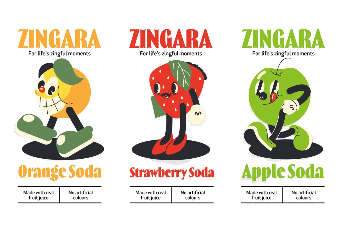
Children’s snacks live at the other end of the spectrum. They’re plastered with cartoon mascots, bold colours and chaotic typography. Who are they trying to impress? The kids begging in the aisle, obviously – but also the adults who get a hit of nostalgia from characters that remind them of their own childhood treats. It’s loud and it works.

🌈 Colours do a lot of heavy lifting in design. Deep blues and golds tend to signal trust and prestige, which is why banks and whisky brands love them. Acid brights, on the other hand, give off energy and playfulness, so you’ll see them plastered across energy drinks and youth-focused snacks. Even before you read the label, your brain has already started to make assumptions.

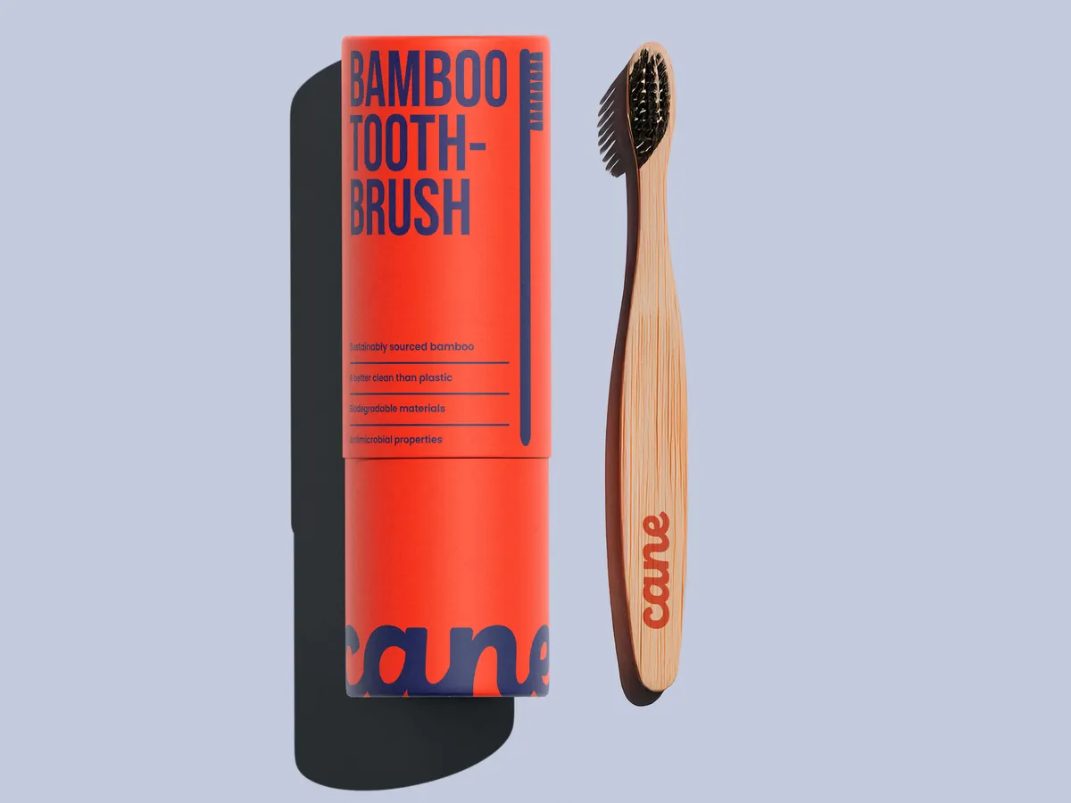
◾️ Shapes add another layer. Packaging with soft curves or rounded edges often feels approachable and friendly – great for comfort food or family brands. Angular, geometric shapes feel sharp and decisive, which is why tech brands lean into them. The difference is subtle, but it changes how you feel in a split second.

✍️ Then we get typography - which is a whole other story. A serif font with little flicks and tails has history baked into it – it feels traditional, established, even a bit formal. That’s why luxury goods and heritage alcohol brands love them. Sans-serif fonts, stripped of all the fuss, feel modern and efficient, so they crop up everywhere from start-ups to skincare brands promising a clinical edge.

None of this is accidental. Brand designers use these cues to influence perception and nudge behaviour. You might not consciously notice why a bottle of gin looks premium or why a skincare brand feels clinical, but your brain is already filing it into the right category. Get those choices wrong, and you confuse your audience. Get them right, and you’re halfway to the till before you even know it.

Once upon a time, if your packaging worked on the shelf, you were sorted. Now? Not so simple. Check out the table below for some tips on how to translate that shelf impact onto a screen:
| What to think about | Why it matters | Noramble tip |
| Logos at every size | On a shop shelf your logo might be huge, on Instagram it’s smaller than your fingernail. | Test it in both extremes. If it turns into a blob at thumbnail size, rethink it. |
| Colour consistency | Colours behave differently in print vs on screens. That lush green on your pack might glow radioactive online. | Build a digital + print colour palette so both look intentional, not accidental. |
| Tone of voice | Shoppers read your packaging, followers read your captions. If they don’t feel like the same “person,” trust wobbles. | Write everything in one voice – whether it’s a tagline, a pack description or an Insta Story. |
| Photography style | Studio-lit product shots don’t always translate to social feeds. | Decide a style that works across formats – e.g. lifestyle shots for Instagram and crisp cut-outs for e-commerce. |
| Motion and interaction | Online, your brand isn’t static – logos animate, type moves, audio matters. | Create simple assets (like animated stickers or short logo stings) to bring your identity to life digitally. |

A customer might first meet your brand on Instagram, click through to your website, and only weeks later finally spot you in a shop. If the design doesn’t hold up across all those touchpoints, you risk breaking the spell.
That’s why modern brand design has to flex. A logo has to be recognisable when it’s the size of a thumbnail on someone’s phone and when it’s splashed across a billboard. Colours need to look right both in print and glowing out of a screen. The tone of voice on your packaging has to feel the same as the captions under your posts. Every inconsistency is a chance for doubt to creep in – and doubt slows down sales.

Design is never “just design”. It’s the shortcut your customer takes when they decide what to pick up, what to trust and what to ignore. From cheese aisles crying out for a glow-up to Ferrero Rocher convincing people that ten quid for twelve chocolates is somehow fine, visuals quietly steer buying decisions every single day.
When colour, shape, type and tone all line up, you build trust without saying a word. When they don’t, you lose people before you’ve even had the chance to pitch. And in today’s world – where shoppers first meet you on a screen and only later on a shelf – cohesion across every touchpoint is key to survival.
At Noramble, this is the stuff we obsess over. We design brands that sell, stick, and stand out. So if your design feels like it’s slowing sales down instead of speeding them up, maybe it’s time we had a chat. We’ll bring the cheek, the strategy and the glue to stitch your brand into something unforgettable. Fancy working together?