
Design mistakes can lead to a loss in sales, loss in business reputation, and being pushed out of your market space – and that’s even before your customer gets to experience your product.
Take it from a packaging design agency; we know the delicate art of creating something that gets noticed, picked up, and chosen above anything else on the shelf. Here are our most important packaging design mistakes to avoid.
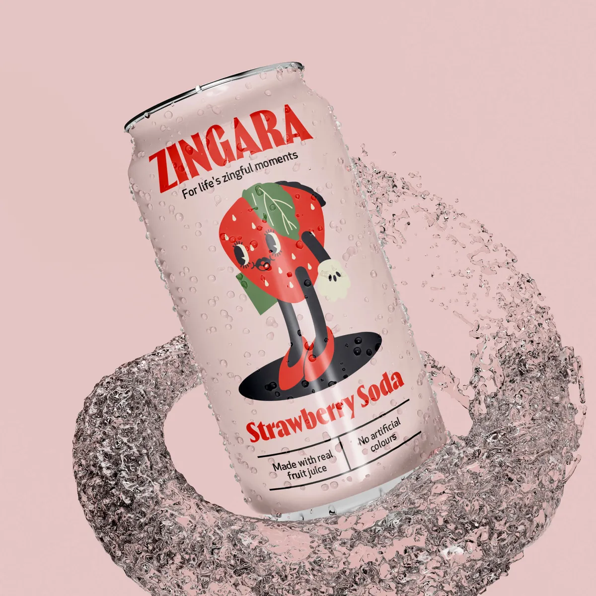
This is a common issue of contention between designers and clients. There might be a lot of information that needs to be included on the packaging. The urge to use up precious space to add more detail comes at a price and can really negatively impact the design. This isn’t going to change in the future of packaging design. It’s the responsibility of the designer to make sure there’s a balance so all the important information is present and complemented by the right amount of visual information.
🔍 Mistakes in excessive detail…

In a perfect world, we’d be able to hit all the requirements of functionality and aesthetics (and we do, of course 😉), but sometimes, as a designer, you must choose between the two. How do you make this decision? It really depends on the expectations of the project. Here are some factors that will affect your choice.
🎨 Mistakes balancing aesthetics with function…
1. Misunderstanding the target market
Prioritising aesthetics or function in packaging really depends on who you expect to be unwrapping the product. There are some audiences which would forfeit functionality for a higher-value aesthetic, especially if that is an aspect of the brand they enjoy. On the other hand, there are audiences that demand functionality over form. If it’s a children’s product, for example, children and adults will have a more positive reaction to the product if it makes life easier.
2. Missing opportunities to double up design elements as functional features
Resealable closures, flexible materials, measuring indicators – there are many ways you can create a design that enhances the overall aesthetic, including practical, functional elements that are fun to use. By combining these elements into one, you’re blending the experience for consumers into something that is intuitive and enjoyable.
3. Over-emphasising aesthetics at the expense of functionality
While the look and feel of your packaging design can be the essential defining characteristics that get it noticed, excessively focusing on aesthetics and compromising on usability results in a product that simply fails to meet needs; and if it’s bought once, it won’t be bought again.
4. Ignoring the impact of texture and colour in design
Colour and texture can have a significant impact on the way a product looks, but they can also seriously impact how it is perceived. Disregarding this is a surefire way to lose the interest of consumers who find the packaging difficult to understand.
For example, a gloss finish on cardboard packaging can be slippery and some customers could find it difficult to get a purchase on the packaging to open it. Dark colours may create a certain effect in line with the brand design but prevent consumers from seeing vital safety information.
5. Failing to communicate functional benefits
You could incorporate some of the most ingenious functionality elements in your design, but if they’re not clearly visible, users could misunderstand the value of your product. There are some crucial design elements that make the difference between good packaging and great packaging and, by proxy, elevate the product.
If your packaging is made with materials that extend freshness, make that clear in the design so your customers are aware of the extra value they’re getting. This makes a huge difference if your’re designing for food and beverage products or beauty cosmetics. There are, of course, also laws on health and safety information that need to be on some packaging, such as consumables, so it’s important your packaging demonstrates that these are met clearly.
What do you want customers to get out of the unboxing experience? Do you want to take them on a brand journey? Inform them about the product? Or just make sure they can get into it conveniently? Whatever your objective, there are some unboxing cues that can easily lead to failure.
📦 Mistake in unboxing…
These details are especially important when designing packaging for eCommerce, where your customer will have the visual impact well before the entire sensory experience.
| Element | Memorable Unboxing | Forgettable Unboxing |
| Brand Identity | A strong brand identity is clearly depicted, and the user is invited on a brand journey using the packaging. | The packaging looks unremarkable and the brand identity is not immediately very clear. |
| First Impression | The visual design of the packaging is both highly relevant to the brand, product, and audience and features some unique elements. | Plain and generic visual elements make it harder for the product to stand out on the shelf. |
| Sensory Experience | Material textures and sounds related to the product. Smell can also be used to introduce the product and relate it to the brand. | Sensory elements are unrelated to the product or lack distinction. |
| Interactivity/Engagement | Elements like QR codes, clever packaging mechanics, and repurposeable parts enhance the experience. | Predictable or overused interaction patterns are too generic. |
| Emotional Connection | Personalisation, high relevance to the intended customer, and detail touches like inserts and reusable elements. | Standard solutions seem to appeal to a broad and unspecified consumer. |
The personal touches on packaging can go a long way to ensuring users pay attention to the product and remember the experience of using it. Take a look at our packaging for Methodology, a shampoo brand with brand messaging that focuses on the uniqueness of the consumer’s own hair and identity. We used tone and message together with minimal design to pull off a packaging product that speaks directly to the customer.

Need help with your packaging design? Get in touch today.


