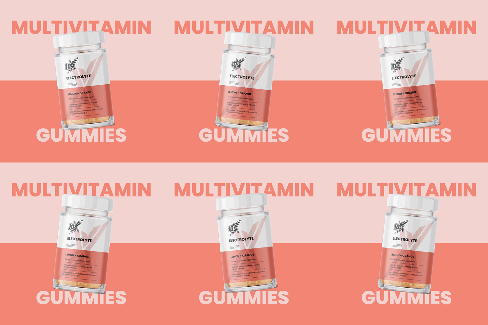
Packaging design for 10X Athletic's gummy range
[2025]
10 X Athletic 7

10X Athletic Gummies

10X Athletic Gummies

10X Athletic Gummies

10X Athletic Gummies

10X Athletic Gummies

10 X Athletic 7
About the project

Creating a premium gummy range that's more lifestyle-focused.

The challenge

10X Athletic needed packaging for a new edible gummy range that could stand apart from their existing brand and support a more premium position in the category.

What we did
Packaging Design
Brand Design
Clichés we rebelled against
Sports nutrition packaging typically leans on black backgrounds, neon accents and aggressive, gym-driven typography to signal intensity. Flavour is usually communicated through loud graphic bursts rather than restrained colour, on the assumption that shoppers want energy signalled instantly rather than implied.
10 X Athletic 7
10 X Athletic 2
10 X Athletic 3

The approach

We kept the brand’s existing ‘X’ icon but pushed it into the background as texture rather than a shouting foreground graphic, and used crisp typography instead of the category’s usual aggressive lettering to match the premium positioning the brief called for. Bold colour still carried the flavour cues, but without tipping into the neon clutter typical of the category.

10 X Athletic 8
10 X Athletic 9
10 X Athletic 12
10 X Athletic 10
Flavour
10 X Athletic 18
10 X Athletic 16
10 X Athletic 17
10 X Athletic 19

More of our
fave' work