
Ever notice how when someone says "it’s vintage," it’s almost always a compliment? That word carries weight now. It's short for timeless, authentic, and somehow... cooler. We live in a culture that celebrates the past in all kinds of ways: raiding charity shops for ‘60s silhouettes, turning VHS filters into TikTok trends, and yes bringing a vintage twist to modern packaging design.
But listen up - vintage only works when it feels genuine. It’s not for everyone. It has to align with your brand’s story, your values, your vibe. Slapping a retro font on a label doesn’t make it nostalgic – it makes it confusing (and maybe a bit try-hard).
Right now, we’re glued to screens and surrounded by minimalist design. And yet, vintage-inspired packaging design cuts through – not because it’s louder, but because it feels like something we’ve known forever. It reminds us of the things we didn’t know we missed.
Nostalgia is a feeling and the smartest brands are trying to figure out how to bottle that feeling (sometimes literally) to create lasting connections, even with Gen Z, who weren’t around for the “good old days” but are still drawn to the stories they tell.
In this article, we’re diving into how vintage design is being reinvented for today’s market, why nostalgia is such a powerful marketing lever, and which brands are striking that perfect balance between old soul and new edge.
Vintage packaging isn’t about turning back the clock – it’s about pulling on emotional threads that remind people of something warm, familiar, and maybe even a little magical. The trick isn’t to recreate the past exactly as it was, but to reinterpret it in a way that feels fresh, intentional, and relevant today.
Done right, vintage elements don’t make your brand design feel dated – they make it feel grounded. They signal heritage, craft, and care, while still leaving space for innovation. And yes, it’s entirely possible to build something that looks modern and new, yet carries that unmistakable charm of the past.
So, how are brands pulling this off? Let’s break down the design details that are helping the past make a stylish comeback.
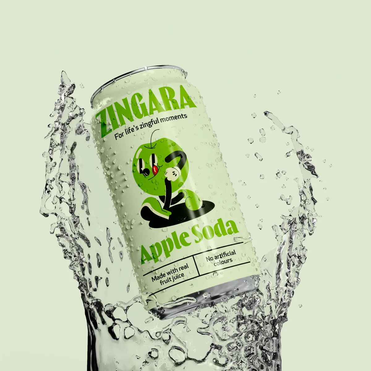
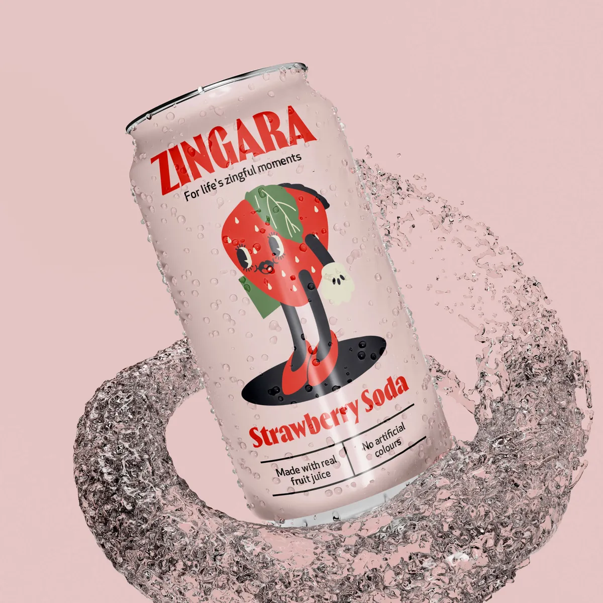
Typography is often the first sign that a brand’s playing with nostalgia. Think hand-painted signage, swirly cursive, bold slab serifs – the kind of lettering you’d find on a soda shop front or a 1940s newspaper ad. It instantly communicates familiarity and craft.
Colours take on a faded charm, too. We’re seeing palettes lifted straight from sun-bleached postcards: dusty rose, sage green, mustard yellow, and deep navy. These shades say “heritage” without the need for a single word.
Materials make the magic tactile. Textured packaging design using paper, tin, glass, or kraft cardboard gives products an authenticity that laminated plastic can’t fake. They often make the product feel more premium, too. Today’s brands are recreating these retro vibes using sustainable materials that align with current values. Recycled glass, compostable wraps, and FSC-certified paper stock bring credibility and conscience to the mix. This is proof that vintage-inspired design doesn’t have to compromise on the values that matter today. It’s nostalgia, upgraded for a world that needs better choices.
Layouts: One of the most quietly powerful elements of vintage-inspired packaging is the layout – specifically, the way everything is centred, symmetrical, and thoughtfully spaced. It’s a design approach that feels calm, composed, and confident. And it’s travelled surprisingly well into the modern era.
Back in the day, layouts were all about clarity. There was an intentional rhythm to them – the brand name often sat at the top, the product description nestled in the middle, and maybe a visual or border framing it all. The hierarchy was obvious, the message was clear, and the overall effect was almost meditative. You weren’t being sold to – you were being invited to engage.

Image Source: urbanoutfitters.com
Illustration in packaging design is getting a throwback moment as well. Instead of glossy vector art, brands are turning to sketchy, imperfect hand-drawings. Whether it’s fruit on a jam jar or a milkman mascot, these touches tell stories before the copy even starts.

Now, contrast that with today’s norm. Much of modern packaging design is built to fight for your attention. Bold, overlapping graphics. Asymmetry. Hyper-saturated colour. Typography doing gymnastics. It’s loud on purpose because it has milliseconds to make you look.
That’s what makes these vintage-style layouts so refreshing today. They go against the grain. Instead of shouting, they slow you down. The structure feels deliberate, like someone took the time to place each element by hand, not churn it out. That kind of order doesn’t feel old-fashioned; it feels brave.
So yes, centred, balanced layouts might seem simple, but they carry the weight of history and they still work. That’s the magic of design details that stand the test of time.
This isn’t about cosplay. Good vintage-inspired design knows when to bring in the updates.
The old look doesn’t mean old habits. Today’s brands are recreating vintage vibes while staying sustainable – because nothing kills nostalgia faster than non-recyclable plastic.
Seedlip, the world’s first distilled non-alcoholic spirit, leans into a classic botanical look with apothecary-style glass bottles, minimalist typography, and nature-led design. It feels like something you'd find in a Victorian house – but behind the scenes, they’re innovating with low-impact ingredients and sustainable packaging.

Image source: seedlipdrinks.com
Montezuma’s, a British chocolate brand, has embraced kraft paper wraps, foil-free options, and biodegradable inner linings – all while using bold, retro-inspired graphics that wouldn’t look out of place in a 1970s sweet shop.

Image source: montezumas.co.uk
BrewDog is another prime example. With strong punk roots and an eye for vintage poster-style branding, they've combined their rebellious aesthetic with carbon-negative brewing practices and plastic-free packaging across most of their range.

Image source: brewdog.com
You wouldn’t expect to find a QR code on a pack that looks like it belongs in your nan’s kitchen cupboard, but some brands make it work.
Urban Outfitters, while a retail brand rather than a product-based one, plays this duality brilliantly. They’ve made vinyl records cool again, styled their stores like vintage treasure troves, and yet everything’s backed by a seamless website, mobile checkout, and Instagram-friendly product drops. They know their customers want a blast from the past and a next-day delivery option.

Image source: urbanoutfitters.com
Fortnum & Mason, the London-based heritage brand, fuses centuries-old design with tech in clever ways, including scannable product tags in-store that tell the story behind their preserves, teas, and biscuits. Tradition, meet tech.

Image source: fortnumandmason.com
Vintage packaging isn't just about looking the part, it's about creating a narrative. The most powerful brands know how to use their heritage (real or inspired) to make customers feel something through brand storytelling.
🍫 Cadbury
Cadbury’s Dairy Milk redesigns occasionally dip back into their archives – with subtle tweaks to their iconic purple, the original signature logo, or simplified typefaces that echo their early 1900s look. Their campaigns often reference nostalgia (like “Glass and a Half” storytelling), tying family rituals and British heritage into the brand story.

🥃 Johnnie Walker
Their special edition labels and "Keep Walking" heritage storytelling often lean on vintage design to reinforce legacy. The illustrations, colour choices, and bottle design evoke a sense of refinement and history – even when launching new or experimental blends. They've built an entire narrative empire out of a striding figure first drawn over a century ago.

Image source: jonniewalker.com
🧼 Imperial Leather
A bath-time classic that uses its packaging – with its regal crest, gold foil, and symmetrical layout – to evoke heritage, reliability, and that quintessentially British notion of indulgent tradition. Even when they update the scent ranges or modernise their formulas, the brand storytelling remains rooted in comfort and familiarity.

Image source: imperialleather.co.uk
When brands get it right, vintage design becomes a powerful bridge between the emotional pull of the past and the ethical, digital, and functional demands of the present.
Authenticity is key. If your design looks vintage but feels soulless, people will clock it instantly. A good redesign also understands which parts of the brand's history are worth spotlighting, and which ones should be left alone.
Redesigns work best when consumers feel included – not just sold to. Testing concepts with real users, integrating feedback, and launching with campaigns that highlight the “why” behind the look? That’s what makes a re-design stick.
So why does this work? Why are we falling for designs that look like they came from our grandparents' era? The answer is simple: it makes us feel something.
Nostalgia hits us right in the dopamine. It’s emotional, powerful, and personal.
When someone sees a familiar design, maybe something reminiscent of a product from their childhood, it stirs memories, creates comfort, and makes them feel like the brand “gets” them. In moments of uncertainty (and let’s face it, there’ve been a few), these emotional connections are worth their weight in gold foil typography.
Nostalgia also creates a sense of trust. If something looks like it’s been around for decades, our brains are more inclined to believe it’s stood the test of time – whether it has or not. There’s a psychology to it.
Brands aren’t just playing dress-up – they’re using vintage design with precision. This is particularly true when marketing to Millennials and Gen Z, who may not remember the originals but romanticise the past as a reaction to today’s hyper-digital world.
Social media only amplifies the trend. Throwback packaging makes for shareable, highly aesthetic content. A well-lit shot of a retro-styled chocolate bar can do more on Instagram than a month of ads.
Not all nostalgia hits the same. The key is figuring out what era your audience romanticises – and why. It’s less about historical accuracy and more about emotional shorthand. What feels good? What feels familiar? What makes them say, “I remember that!” (even if they don’t, technically).Here’s a few to think about:
👉 1960s Psychedelia - Groovy patterns, floral prints, peace signs, and swirling typography. Perfect for lifestyle or wellness brands that lean into bohemian, free-spirited energy. Bonus points for anything hemp, herbal, or handmade.
👉 1970s Earthy Retro - Avocado green, burnt orange, shaggy textures and bold serif fonts. This era oozes nostalgia for slow living, handmade goods, and analogue charm. Ideal for home goods or sustainable fashion.
👉1980s Neon & Nostalgia - Bright colours, arcade graphics, VHS vibes, and synthwave fonts. If your audience grew up with Saturday morning cartoons or rented tapes from Blockbuster, this hits hard. Great for snack foods, games, or retro tech brands.
Don’t sacrifice usability for style. Retro shouldn’t mean hard-to-open tins or unreadable fonts. Nostalgic design can be stunning, but if your beautiful tin can’t be opened without a crowbar, it’s not going to work. Retro fonts might look charming, but if your ingredients list is unreadable or your brand name is lost in a swirl of vintage script, you’ve sacrificed clarity for style. Good design should serve the customer first – nostalgia comes second.
Tell a story. People love a narrative – even more if they can see themselves in it. The best stories don’t just talk about you – they create space for the customer, too. Let them imagine how your tea brand started in a tiny 1930s kitchen… and how it fits into their Sunday morning routine now. Whether it’s a family recipe, an old-school production method, or a design that’s been passed down, just share it. Give people something to emotionally invest in.
Think of nostalgia like sea salt: used right, it enhances everything. Used too heavily, and it's all you taste. A vintage-inspired typeface, a hand-drawn mascot, or a throwback colour palette might be enough. If every single design choice screams blast from the past, you risk looking a bit silly. Choose your nostalgic moments with purpose – they’ll hit harder when they’re not fighting for attention.
The beauty of nostalgia is that it’s personal. So why not make your community part of the conversation? Ask your audience to share their memories, old photos, or stories connected to your product or what it reminds them of. Run a campaign where customers vote on retro label designs or submit their own “vintage vibes” reimagining. It’s a way to co-create something meaningful. Nostalgia hits harder when it’s shared.
Retro doesn’t mean retrograde. The smartest nostalgic branding brings the old into the now. That could be pairing a 1970s-inspired look with carbon-neutral production, or including a QR code on your label that links to a brand story video. When you can make heritage feel current, you don’t just appeal to memory – you build trust for the future.

Vintage-inspired packaging isn’t about living in the past – it’s about mining it for gold. The tactile joy, the emotional resonance, the shared memories – all of these make retro design a powerful branding tool when done with care and purpose.
When you blend nostalgia with modern needs, you build bridges between generations, tell better stories, and give your product something many designs don’t have: a pulse.
Thinking of reviving your brand’s roots or adding a little retro charm to your shelf presence? At Noramble, we help brands build the kind of packaging that feels like it’s always been there – even if it’s brand new. Let’s bring your heritage to life. Get in touch.


