
Think about when you're browsing on the retail shelves, what do you look out for? What catches your eye? Packaging design is a powerful driver of sales. In a lot of cases, eye-catching packaging can turn a browser into a buyer in seconds. This article dives into the importance of shelf impact and how strategic packaging design can influence consumer behaviour. We'll explore three areas: creating eye-catching designs, mastering shelf placement, and leveraging consumer psychology to make your products fly off the shelves.
We’re not just talking about surface-level stuff like colours and stand out fonts – though those are mega important. Packaging design goes way beyond that. It's about creating an experience, telling your brand’s story, and really connecting with your customers. Think of the joy of unboxing something special or spotting a product at eye level in a store that instantly grabs your attention. Every little detail counts when it comes to making a lasting impression and boosting those sales.
The unboxing experience! Nothing feels better than receiving a product that has a surprise element to it. A memorable unboxing experience is essential for winning customer satisfaction and loyalty. Think of the excitement of peeling back layers to reveal a well-thought-out product. We see brands like Apple and Glossier that excel at this, turning unboxing into a ritual that consumers eagerly anticipate. These interactive experiences can turn customers into brand advocates, sharing their excitement on social media and driving word-of-mouth marketing. Think about smart packaging that will get your customers buzzing to open your product, creating an unforgettable first impression that keeps them coming back for more.
Your packaging is a chance for you to tell your brand story. It’s an opportunity to communicate your brand’s values, heritage, and mission. A well-crafted story can differentiate your product in a crowded market. For instance, Ben & Jerry’s uses its packaging to tell stories about social justice and environmental sustainability, creating a deeper connection with their consumers. Same with Oatly – they use their packaging to convey their commitment to sustainability and transparency, with quirky, honest messages that resonate with eco-conscious consumers. By effectively telling your story through packaging, you can create a unique identity that stands out and builds a loyal customer base.

Image source: Ben & Jerry's

Image source: Oatly.com
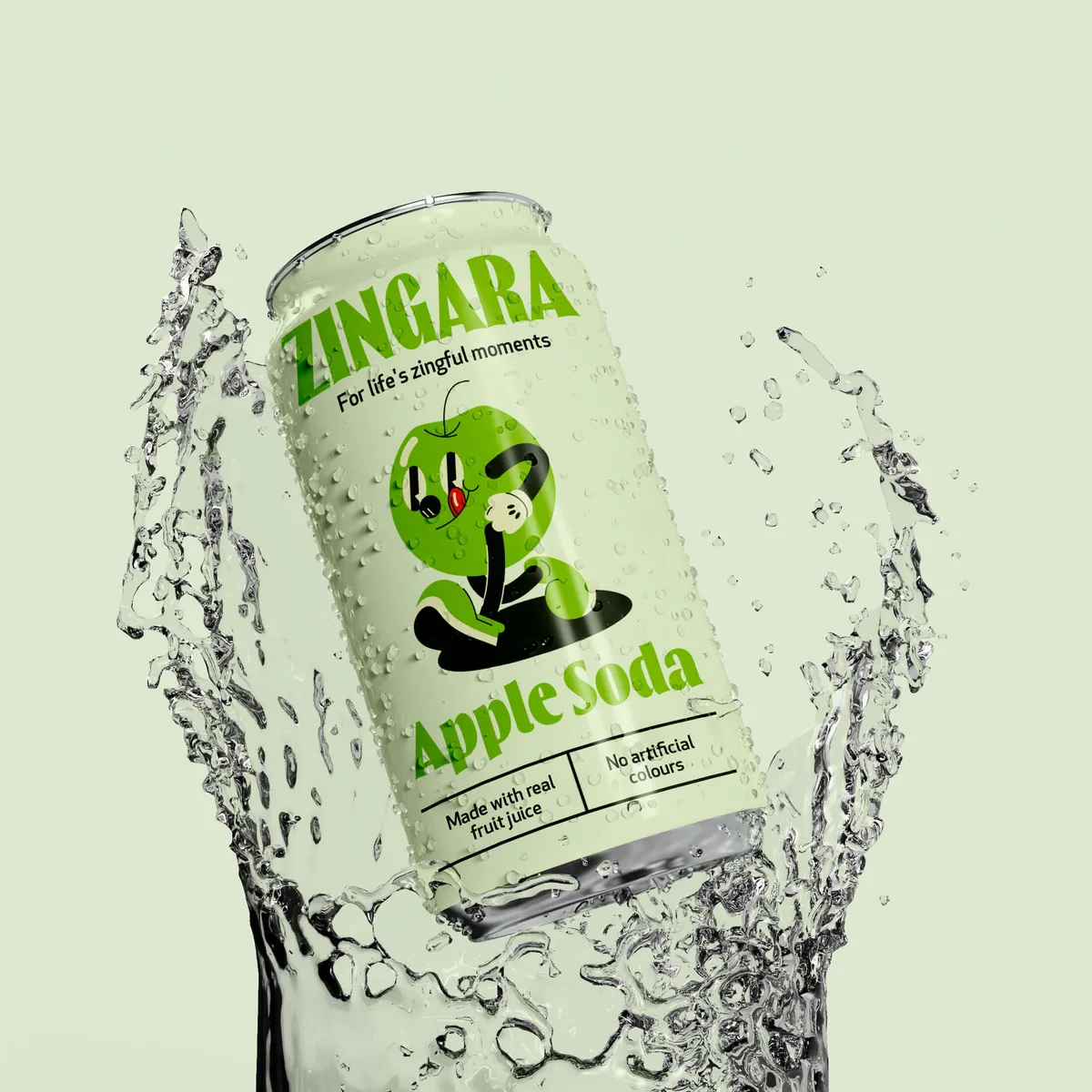
Let's take a look at Zingara. They needed packaging that matched their vibrant and authentic brand story. Their packaging truly reflects their brand essence – embracing bold colours, dynamic typography, and playful illustrative fruit mascots to bring the vision of “Life’s Zingful moments” to life. This design effectively communicates their energetic and joyful spirit to customers. By focusing on these dynamic design elements, Zingara has created a unique identity that not only stands out on the shelves but also fosters customer loyalty. Their packaging isn’t just visually appealing; it’s a storytelling tool that conveys their brand ethos and connects deeply with their audience.

By effectively telling your story through packaging, you can create a unique identity that not only stands out but also builds a loyal customer base.
Effective storytelling on your packaging can turn your products into more than just items on a shelf—they become part of a larger narrative that customers want to be a part of.
Typography isn't just about choosing a pretty font; it's about creating a visual hierarchy and guiding the consumer's eye. Effective typography can enhance the appeal of your packaging and make it more inclusive, readable and engaging. Think about how you can make your product packaging accessible to all. Stick to these best practices: use contrasting fonts for readability, keep it legible from a distance, and ensure the typography aligns with your brand identity.
Let’s look at Popjoy’s effective use of typography. Noramble crafted dynamic typography and graphic elements that perfectly captured the brand's energetic personality, effectively highlighting flavour names and product features. They incorporated playful illustrations and vibrant colour palettes to create visual interest and boost shelf visibility. This approach not only made the packaging stand out but also communicated the product’s unique attributes in a fun and engaging way.


Key elements of an eye-catching design:
Steps to create an effective unboxing experience:
If customers have to stretch, squat, or do a little dance to reach your product, it's probably not going to sell as well. This is what we mean by shelf impact. Think about your customers—make it easy for them! Place your product where it's most visible and accessible. After all, if they can't see it or reach it, they can't buy it. So, let’s put your product right where it belongs: front and centre, at eye level, ready to leap into shoppers' baskets with minimal effort.
Where your product sits on the shelf can make or break its sales performance. Effective shelf placement strategies include positioning products at eye level, using end caps, and ensuring optimal product facings. For example, supermarkets often place high-margin items at eye level to catch the consumer’s attention and boost sales.
Positioning products at eye level is a tried-and-true method to increase visibility and sales. Research shows that products placed at eye level are more likely to be purchased. This is because they are in the direct line of sight and require less effort to locate.
Research found that products placed at eye level can see a sales increase of up to 23% compared to other shelf positions. Items placed above or below eye level are less effective; with research showing that products above eye level may be difficult to see and reach, while those below eye level require bending or squatting, which can deter customers from purchasing them.
Benefits of optimal shelf placement:
👀 Increased visibility
👀 Enhanced product appeal
👀 Higher likelihood of impulse purchases
Colours have a mega impact on consumer decisions. They can evoke emotions, create associations, and influence perceptions. Different colours evoke specific emotions and behaviours. Studies show that blue can instil a sense of trust and calm, making it a popular choice for financial institutions, while green is associated with health and tranquillity, perfect for eco-friendly and wellness products.
❤️ Red: Conveys excitement and urgency. Perfect for drawing attention and creating a sense of immediacy.
💙 Blue: Evokes trust and calm. Ideal for brands wanting to appear reliable and serene.
💚 Green: Associated with health and tranquillity. Great for products promoting natural and eco-friendly qualities.
💛 Yellow: Represents optimism and warmth. Used to create a cheerful and welcoming feel.
💜 Purple: Signifies luxury and creativity. Perfect for high-end and innovative products.
🧡 Orange: Exudes energy and enthusiasm. Ideal for brands targeting active and adventurous consumers.
🖤 Black: Denotes sophistication and power. Often used in luxury and premium products.
🤍 White: Suggests purity and simplicity. Common in healthcare and minimalist designs.
Understanding these basic colour associations can help you create packaging that not only looks good but also connects emotionally with your target audience.
Take a look at this brand Methodology. What are your thoughts? The colours stand out don’t they? Not to mention the added layer of humour “curly hair shampoo/conditioner for people with (you guessed it) curly hair types”. This touch differentiates the product from its competitors and adds a playful, approachable vibe. The bright colour palette is eye-catching and reinforces the brand’s lively and fun personality. This combination of striking visuals and humour not only attracts attention but also builds a positive emotional connection with consumers, making the product memorable and more likely to be chosen
But understanding the psychology of consumer choice goes beyond colour. It involves a deep dive into how packaging elements influence decision-making. Here are a few notable aspects:

👉Visual Hierarchy
Visual hierarchy refers to the arrangement of design elements in order of importance. Consumers' eyes are naturally drawn to certain areas first based on size, colour, and placement. A well-structured visual hierarchy can guide the shopper’s journey across the packaging, highlighting the most important features such as the brand name, product type, and key benefits. This helps in quickly conveying the product's value proposition.
👉Cognitive Ease
Cognitive ease is the comfort with which our brains process information. Simpler, more intuitive designs are easier for consumers to understand and are more likely to be chosen. This involves using clear, concise messaging, familiar symbols, and straightforward layouts that reduce the mental effort required to process the information. Overly complex designs can confuse consumers and make them less likely to make a purchase. People want to know what they’re buying from the off-set!
👉Social Proof
Social proof is a psychological phenomenon where people assume the actions of others in an attempt to reflect correct behaviour. Including elements like customer reviews, testimonials, and awards on packaging can serve as social proof. When potential buyers see that others have had positive experiences with a product, they are more likely to trust and purchase it themselves.
👉Sensory Appeal
Beyond visual elements, sensory appeal plays a significant role in consumer choice. This includes the texture of the packaging, the sound it makes when opened, and even the smell. High-quality materials that feel good to touch or a packaging design that emits a pleasant fragrance can enhance the overall perception of the product. Sensory appeal creates a multi-dimensional experience that can significantly impact purchase decisions. Get creative! Or find a packaging design agency that can do it for you 😉👀.
Effective packaging design is a blend of art and science. By creating eye-catching designs, strategically placing your products, and understanding the psychology of consumer choices, you can maximise your product's shelf impact. Don’t underestimate the power of well-thought-out packaging. For those looking to elevate their packaging game, our team at Noramble is here to help. Get in touch for packaging design services that sell. We can help you with packaging design, brand design and brand strategy.


