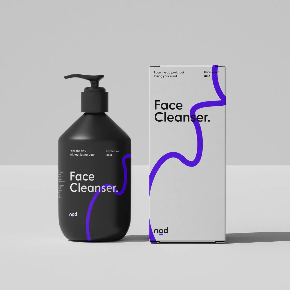
So you’re wondering how to balance form and function in packaging design? You’ve come to the right place. Striking that perfect balance affects not just how your brand is perceived but also how it performs in the cut-throat arena of market shelves and the online space. At Noramble, having a nice design is not the only consideration in the design process. We're engineering containers that speak to people on the shelf and function like a dream. Let’s unpack how blending stunning designs with quality usability sets our packaging apart and paves the way for brand success.
Ever wonder what makes you reach for a product on the shelf or click an item into your online shopping basket? Chances are, it's a killer combo of form and function. Aesthetic appeal hooks your attention, baking a memorable brand right into your brain. But it's the function—those easy-open tabs and frustration-free seals – that brings you back for more. In an eco-conscious world, packaging that's both pretty and practical is a must.
Modern shoppers are savvy; they want it all – looks that kill and gear that works hard. With e-commerce unboxing videos turning into a genre of their own, how your product arrives at the doorstep matters as much as what’s inside. Brands are catching on, turning to designs that marry functionality with flair, ensuring the first impression is as strong as the daily performance.
✔️Enhances brand recognition and loyalty.
✔️Improves user satisfaction and unboxing experience.
✔️Reduces waste through functional, eco-friendly design choices.


From concept to shelf. Functional design isn’t just about throwing in a few flaps and labels; it’s about crafting experiences. Think durability, think sustainability, think about that satisfying ‘click’ a well-made package makes when it closes just right. Design trends are skewing towards materials that not only recycle but also reincarnate – we’re talking about biodegradable buffers and reusable wraps. 8 out of 10 UK consumers reported that they prefer environmentally-friendly products. Remember, you need to deliver on what consumers want. You want to keep that environmental impact to a minimum.
👉Practicality: Make it easy – easy to open, easy to carry, easy to store.
👉Durability: Packaging should protect, preserving your product (and the planet).
👉Sustainability: Go green without going obscure; make eco-friendly look good.
The Amoebic case study by Noramble exemplifies a great balance between form and function in packaging design. We crafted a luxurious and functional packaging experience for the Amoebic skincare brand by blending natural beauty with practical design elements. The packaging features sleek, ergonomic shapes inspired by natural forms. These design choices not only enhance the visual appeal but also offer a tactile dimension, inviting users to engage with the products on a sensory level.


First impressions are visual; make them count. In a world where a scroll is faster than a heartbeat, catching the eye is key. The right colours, the right shapes – they’re the source of standout packaging.
Top Tips:


Why does balance matter? Because it’s the holy grail of effective packaging design. At Noramble, we don’t just aim for functionality or just go for pretty – we aim for much more. We craft packaging that makes your product an obvious winner from the first glance to the final toss. Our approach? Listen to the market, lead with innovative solutions, and let a pinch of magic lead the way.
Remember, great packaging doesn’t happen by accident. It's a deliberate dance of form and function. Investing in a packaging design agency to take the stress off is a smart move. At Noramble, we master that dance daily, helping brands box up brilliance in every package. Ready to level up your packaging game? Tired of packaging that just packs? Reach out to Noramble for a brand design consultation that will make your products the best around. Let's talk.