
When it comes to grabbing a customer’s eye and making a lasting impression, few things work better than a captivating illustration. Think about it: in a world cluttered with generic packaging, a bespoke illustration can be the lightning bolt that makes a product jump off the shelf into a shopper’s basket. This is where the packaging designers at Noramble come in, applying our refined design skills across a range of sectors including beauty, food and beverage, household, fashion, and commercial B2B. Not just your average packaging design agency, we mix creativity with a direct approach that makes brands stand out against competitors. Want to see how? Keep reading!
Ever wonder what makes your brain tick when you see a playful sketch or a bold, abstract brand design? Here’s the scoop:
👉 Visual Appeal: From the get-go, illustrations forge an emotional bond with shoppers. They’re like the visual version of your favourite song – hard to ignore and even harder to forget.
👉 Storytelling: Where words fail, a clever illustration speaks volumes. It can tell a brand’s story or values at a glance, transforming a simple product into something with character and depth.
👉 Psychology of Colour and Form: Ever felt an unexplained pull towards a product? Chances are, the colours and shapes in its design were speaking to your subconscious.
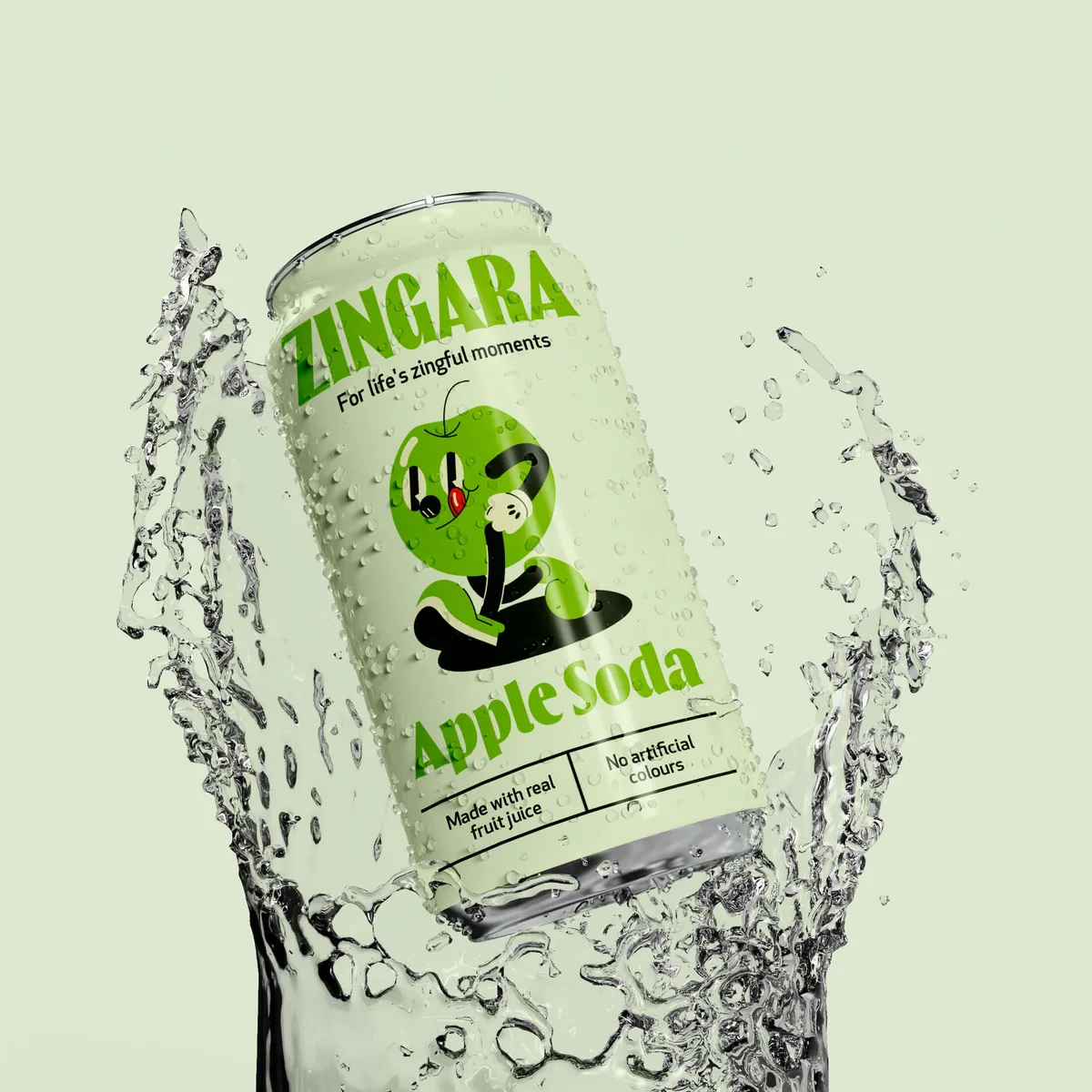
The captivating essence of Noramble's packaging design for Zingara is achieved through a meticulously crafted visual and emotional appeal that aligns seamlessly with the brand's narrative. Here are several ways it manages to captivate and engage consumers:
🍓 Bold Colours: The use of vibrant, eye-catching colours in the packaging immediately grabs attention on the shelf. This visual strategy is not just about standing out, but it also evokes feelings of happiness, energy, and refreshment, which are central to Zingara's brand promise of delivering "Life's Zingful Moments."
🍓 Dynamic Typography: The typography employed is playful yet readable, which not only highlights the product name but also enhances the overall appeal of the packaging. Effective typography creates a visual hierarchy that guides the consumer's eye and conveys key information effortlessly, making the packaging both attractive and functional.
🍓 Playful Fruit Mascots: The illustrations of fruit mascots personify each flavour, adding a layer of storytelling to the packaging. These mascots are not just decorative; they communicate the natural, juicy quality of the product and engage consumers on a more personal level, inviting them to explore the flavours and connect with the brand's joyful and zesty spirit.
🍓 Emotional Resonance: By integrating these elements, the packaging design not only captures the consumer's attention but also builds an emotional connection. The playful visuals mirror the brand's commitment to quality and enjoyment, reinforcing Zingara's position as a provider of delightful, zingful experiences.
🍓 Consistency Across Touchpoints: Maintaining a consistent theme across all packaging and branding efforts helps to reinforce brand recognition and loyalty. Every element from the cans to promotional materials tells a part of the same story, enhancing the consumer's understanding and appreciation of the brand.
This strategic use of design elements makes Zingara's packaging a powerful tool in storytelling, turning everyday products into a shareable and memorable part of consumer's lives. The design does more than just sell a drink; it sells an experience, which is central to creating lasting customer relationships and driving brand success.

It’s not just about looking pretty. Illustrations are a tool for building and reinforcing a brand’s personality and values. A consistent illustration style acts like a brand’s signature—distinct and recognisable. It’s what helps a brand stick in the consumer’s mind long after they’ve left the aisle. With the right illustrations, customers can spot your product from across the store, no logo needed. At Noramble, we’ve worked to transform brands from blending in to standing out.
Noramble's design for Nod Skincare effectively transformed the brand with a minimalistic, masculine aesthetic that appealed directly to its target audience—men interested in straightforward, effective skincare. By integrating a sleek black and white colour scheme with blue accents and a sans serif typeface, the packaging not only stood out on shelves but also conveyed the brand’s emphasis on simplicity. Additionally, the inclusion of messages linking skincare to mental health awareness added depth, resonating with contemporary concerns and enhancing the brand's community appeal. This strategic use of illustration and messaging significantly elevated Nod Skincare's market presence, showcasing Noramble’s deep market understanding.


Food and Drink – Case Study: Popjoy’s Popcorn
Noramble successfully designed PopJoy's Popcorn packaging with a vibrant and playful identity that captures the joy and indulgence of snacking. Utilising bold colours, dynamic typography, and whimsical illustrations, the design stands out in a competitive snack market, enhancing product appeal and recognition. Thoughtful considerations like resealable pouches cater to consumer convenience and maintain the brand’s energetic persona across various packaging formats, ensuring PopJoy makes a memorable impact on retail shelves.


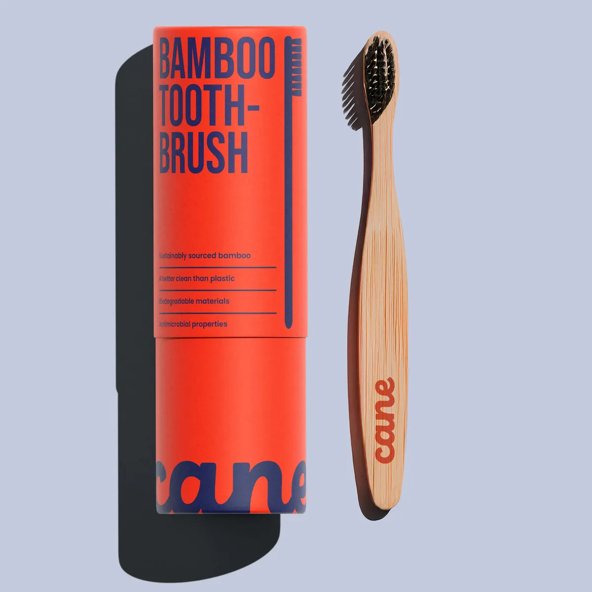
Household – Case Study: Cane
Noramble crafted an effective and eco-friendly packaging design for Cane, a startup specialising in sustainable bamboo toothbrushes. The design features a minimalist and memorable logo incorporating the brand's signature coral orange colour, alongside an illustration of the toothbrush. This branding not only emphasises Cane's environmental commitment but also distinguishes it in the competitive oral care market. Noramble used sustainable materials such as biodegradable cardboard and bamboo pulp to create packaging that not only appeals visually but also aligns with the brand’s sustainable ethos. This approach not only minimises environmental impact but also resonates well with eco-conscious consumers, enhancing the brand's identity and market position.

For Betty Tights, Noramble designed packaging that deeply resonated with the brand's premium and fashionable identity. They developed a visual identity that not only reflected the luxurious and stylish nature of the hosiery but also effectively communicated this to the target audience. The packaging design incorporated elegant and impactful visuals, which helped enhance the product's shelf presence and appeal to consumers looking for high-end tights. This strategic design approach by Noramble ensured that Betty Tights stood out in a competitive fashion market, embodying the brand's chic essence while appealing directly to fashion-conscious buyers.


Illustrations do more than just beautify – they work hard. Let's talk about how you can transfer this to an e-commerce setting:
👉 Online Shopping Experience: On a website, illustrations can guide visitors, highlight key product benefits, and create an engaging user experience.
👉 User Engagement: They help tell a product’s story quickly and effectively, which is crucial in the fast-paced online shopping environment.
When it comes to designing packaging for e-commerce, make sure that your consistency is on point. Whether it’s on a tiny sample packet or a massive billboard, keeping your illustration style consistent is key. Another thing to keep in mind is to avoid overloading the customer with too much design. A great illustration stands out best when it’s not jostling for space with other elements. Keep it clean and let the art shine.
Knowing who you’re talking to is half the battle in effective packaging design. The other half? Speaking their language through style.
👉 Audience Demographics: What works for a teen might not charm a well-heeled boomer. Choosing the right illustration style can make or break how a demographic perceives a brand.
👉 Cultural Sensitivity: It’s a big world out there, and what’s cool in one culture might be controversial in another. Smart brands adapt their visuals accordingly.

Wondering how to make this work for your brand? Give Noramble a shout and let them help you get it right.
Illustrations aren’t just pretty pictures; they’re strategic tools that can elevate your brand from the mundane to the memorable. Curious about how illustrations can transform your packaging? Contact Noramble and watch your brand go further than you can imagine.


