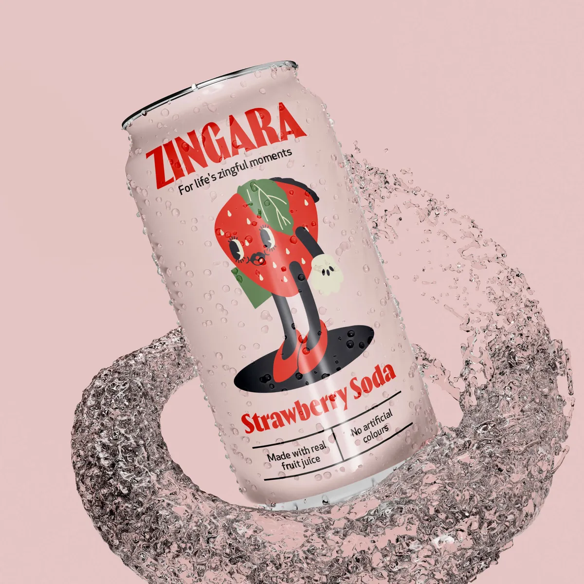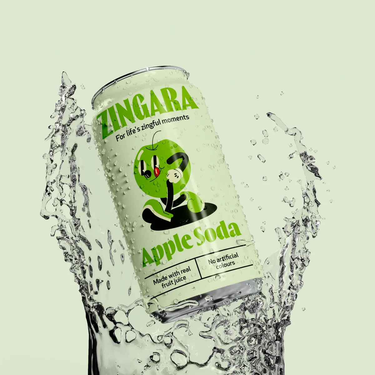
Many people overlook the deep psychology embedded in effective packaging design. It’s not just simply there to keep your product safe and protected. Packaging does so much more, and we’re here to reveal the secrets. What makes you reach for one product over another? Is it the colour, the shape, or just that gut feeling? Let’s look into how smart packaging not only catches the eye, but also engages in subtle mind games.

Why does packaging design matter then? When you pick up a product, the packaging is your first experience with the brand. What message does the packaging convey? Despite many people advising against it, we often “judge a book by its cover”. Our judgements aren’t just superficial; they are deeply rooted in consumer behaviour. A 2018 survey revealed that a significant 72% of shoppers admit that a product's packaging design sways their buying decisions. This statistic highlights the powerful role that visual and tactile elements play in shaping our perceptions and purchasing decisions. By understanding and leveraging this influence, brands can craft packaging that not only stands out on the shelf but also resonates emotionally and aesthetically with consumers.
Packaging design goes beyond aesthetics; it creates an emotional and psychological connection with the consumer. The colours, textures, typography, and even the material quality can evoke feelings of trust, excitement, or nostalgia, subtly guiding consumer behaviour towards a purchase. Each element is a calculated part of the brand's strategy to not only meet the form and functional needs but also to fulfil the unspoken emotional or psychological needs of their customers.
At Noramble, we get it. Let’s look at Nod Skincare as an example. The minimalist design isn't a mere aesthetic choice; it's a strategic decision. This design reflects Nod Skincare's brand story and commitment to simplicity and effectiveness, mirroring the purity and high-quality of their products. By choosing a clean, understated look, we aimed to communicate the brand's focus on essential, no-fuss ingredients that promise genuine results without the clutter of harsh chemicals. The subtle colour palette and streamlined typography enhance the product's shelf appeal, inviting customers into a serene visual experience that stands out in the crowded skincare market. Going a step further, the tactile quality of the packaging ensures a pleasant unboxing experience, reinforcing the premium nature of the brand.


Thoughtful design does more than meet the eye; it fits seamlessly into your life that you might not even notice the actual science behind it. Recall the last time the smooth, rounded edges of a new tech product or the textured handle of your favourite coffee mug made an impression on you. Such experiences aren't coincidental but the result of deliberate ergonomic design. But what do we mean by ergonomic design?
The primary goal of ergonomic packaging is to enhance and complement the product experience. This principle ensures that every design element serves a purpose, either to improve the product’s usability or to make the interaction more enjoyable. From easy-to-open seals to frustration-free wraps, user-friendly packaging minimises hassle and maximises efficiency. This aspect of design not only makes the product accessible but also encourages repeated use.
Safety must be considered in the design process. Consideration for safety means designs that protect both the product and its user. This could mean using materials that prevent contamination or designing mechanisms that are child-resistant yet accessible to the elderly.
👉Beauty: For products in the beauty and cosmetic industry, ergonomics might mean compact, sleek designs that fit comfortably in handbags or makeup kits. These items are often designed with soft edges and easy-to-handle curves that make daily use a luxury.
👉Food and Drink: Ergonomic design in food and beverage packaging often focuses on grips and textures that prevent slipping or spilling which is essential for on-the-go consumption. Features like indented cans or textured wraps can enhance grip, even with wet hands.
👉Household: In the household sector, ergonomics is crucial for ensuring products can be used efficiently in the home environment. Stackable designs and lightweight materials help maximise storage space and ease of use, accommodating our natural movements and storage habits.
Each of these ergonomic features is tailored to meet specific industry needs, demonstrating how ergonomics bridges the gap between attractive design and practical functionality. By focusing on the user’s overall experience, ergonomic packaging goes beyond aesthetics to deliver real, tangible benefits in daily use. At Noramble, we harness these principles to ensure that every package we design not only looks good but feels right, enhancing the connection between the brand and its consumers.


You need to be able to measure your design effectiveness. You want to be able to determine how your success can be quantified by tangible outcomes so we’re talking; increased sales, market disruption, and enhanced brand perception. Let’s see how a simple redesign can transform business metrics.
👉Consumer Feedback: Direct insights from consumers will provide invaluable data on how our packaging designs are received. This involves gathering opinions through surveys, focus groups, and online reviews to understand what elements resonate with consumers and which aspects might need a little work.
👉Sales Data: The ultimate test of packaging effectiveness is reflected in sales performance. Analysing sales data before and after a packaging redesign offers clear indicators of its impact. An uplift in sales post-redesign not only validates the effectiveness but also highlights the direct correlation between innovative packaging and consumer purchasing behaviour.
👉Market Analysis: Comparative studies and competitive analysis help to determine how our packaging stands out in the marketplace. This involves assessing how our designs stand against competitors in terms of visibility, appeal, and consumer preference, providing a benchmark for ongoing improvement and innovation.
👉Colour Psychology: The use of colour is a powerful psychological tool in packaging design. Colours can evoke specific emotions, influence consumer behaviour, and align with brand identity. For instance, blue can convey reliability and calmness, while red might energise and excite potential buyers. Pick and choose your colour palette wisely.
👉Shape and Typography: The shapes and typography used in packaging play critical roles in how a product is perceived. Curved lines might suggest elegance and comfort, whereas sharp angles could project a more cutting-edge, dynamic image. Typography enhances this further, with font choices that align with the product's personality. Make sure it's clear and easy to read too.
👉Texture: Incorporating texture into packaging design adds a tactile dimension that can significantly enhance the user experience. Textured surfaces not only increase grip but can also intrigue the sense of touch, providing a subtle yet impactful reason for a consumer to choose one product over another.

By leveraging these metrics and psychological strategies, we can measure and refine our packaging designs to ensure they not only capture attention but also cultivate consumer loyalty and drive business growth.
From your first glance to your final grab, great packaging design is a mix of art and science. It's not just the inside goods that count; the outside needs to hit home too. Curious how a splash of Noramble creativity can transform your product’s shelf appeal? Get yourself a free brand review and we can go from there. Fancy working together? Get in touch with us!