
When it comes to packaging design, colour is all part of your brand strategy. The shades you pick can spark desire, build that recognition you desperately want, or send your product straight back to the shelf. From influencing consumer behaviour to shaping brand perception and driving sales, colour can quite literally make or break a product’s success. And no, it’s not just about choosing something that “looks nice.” It’s about understanding how colour works — psychologically, culturally, and commercially.
In this article, we’ll break down the basics of colour theory in brand design, unpack the emotional weight behind certain hues, explore how trends can help (or hurt), and look at some eye-catching case studies that prove just how powerful colour really is.
Colour theory is the foundation of effective packaging design. At its core, it involves understanding the colour wheel and how different hues interact. Primary colours (red, blue, yellow) combine to create secondary colours (green, orange, purple), and these further mix to form tertiary colours. Complementary colours (opposites on the colour wheel) create high contrast, while analogous colours (neighbours on the colour wheel) offer harmony.
Colours evoke emotions and associations that can significantly influence consumer behaviour:
❤️ Red: Excitement, urgency, and passion. Often used to grab attention and stimulate appetite (think of fast food logos).
💙 Blue: Trust, reliability, and calm. Popular in corporate and healthcare sectors due to its soothing and professional vibe.
💚 Green: Health and wellness, tranquillity, and nature. Frequently seen in products related to wellness, environmentalism, and natural ingredients.
💛 Yellow: Happiness, warmth, and caution. Used to evoke positivity and alertness but should be balanced to avoid overwhelming the viewer.
🖤 Black: Sophistication, luxury, and power. Ideal for high-end products, offering a sleek and modern appeal.
🤍 White: Purity, simplicity, and cleanliness. Often used in minimalist designs to convey a sense of purity and efficiency.
Understanding these psychological triggers can help in crafting packaging that not only attracts customers but also communicates the right message about the product and brand.

Colour design trends evolve with societal changes, cultural shifts, and technological advancements. Keeping an eye on these trends helps brands stay relevant and appealing. For instance:
Adopting the right colour trends can significantly boost a product's marketability. For example, a shift towards eco-consciousness has led to a rise in products packaged in greens and browns, which are perceived as more sustainable. Similarly, tech brands using bright blues and oranges can appear more cutting-edge and innovative in packaging design. Check out the minimalistic packaging design we did for Nod Skincare. For Nod's visual identity, we aimed to create a design that resonated with the male audience while remaining distinctive in the skincare industry. We chose a black and white colour scheme for its simplicity and elegance. This monochromatic base was paired with an accent colour of purple, adding a touch of modernity and vibrancy.


Coca-Cola's iconic red packaging is a classic example of colour psychology in action. The red evokes excitement and passion, making the product stand out on the shelves and creates a sense of urgency and craving.

Tiffany & Co.'s egg blue packaging is reflective of luxury and sophistication. This distinctive colour has become a symbol of the brand itself, creating a strong emotional connection with consumers who associate it with elegance and high-quality craftsmanship.

Apple's use of white and silver in its packaging underscores the brand’s commitment to simplicity and innovation. The clean, minimalist design not only reflects the product’s sleekness but also creates a premium, modern image.

Method’s cleaning products utilise a palette of greens and other natural tones to emphasise their eco-friendly and non-toxic qualities. This colour choice aligns perfectly with the brand's message and appeals to environmentally conscious consumers.

Image source: Everythingspeachy.co.uk
Noramble was tasked with executing a distinctive packaging design strategy for Zingara's canned soda lineup. The objective was to infuse each can with the vibrancy, spontaneity, and zestfulness that encapsulated the brand's promise of delivering memorable moments of joy and refreshment.
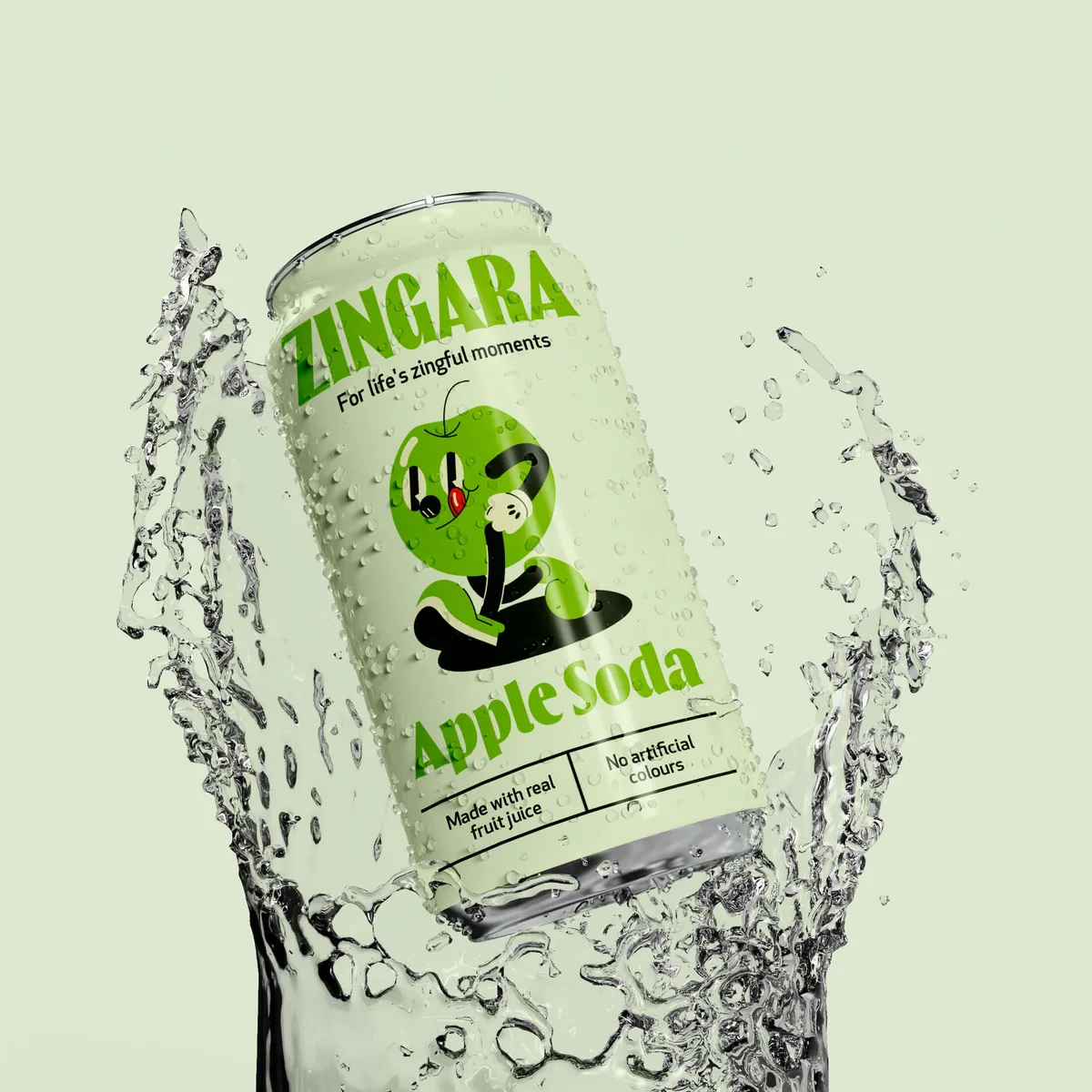
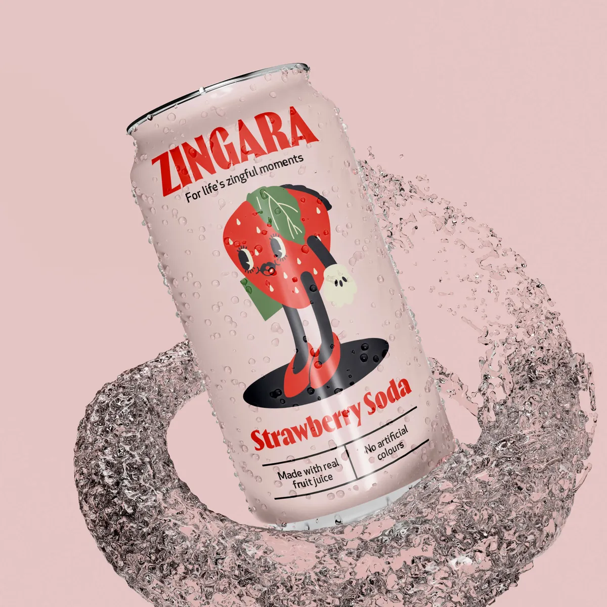
From sketch to shelf, Noramble did an immersive exploration of Zingara's brand essence and target audience aspirations. Through in-depth market research and trend analysis, the team identified the rising demand for natural, healthy soda that had the taste to back it up. The Noramble team set out to align Zingara's packaging with this emerging consumer mindset.
Inspired by the concept of "Life's Zingful Moments," Noramble conceptualised a series of design directions that celebrated spontaneity, adventure, and sensory delight. Embracing bold colours, dynamic typography, and playful illustrative fruit mascots, each design concept aimed to evoke a sense of anticipation and excitement reminiscent of life's most cherished experiences.
The colour palette was selected to reflect the brand's energetic and lively personality. Each flavour of Zingara soda was paired with a specific set of colours that not only made it easily identifiable but also visually represented the taste experience:
🍏Zingara Apple: Fresh greens and crisp whites evoke the refreshing and natural essence of apples.
🍊Zingara Orange: Bright oranges and sunny yellows capture the zesty, invigorating burst of citrus.
🍓Zingara Strawberry: Rich reds and soft pinks reflect the sweet and indulgent flavour of strawberries.
Why does packaging design matter then? Choosing colours wisely in packaging design is all part of the brand strategy which can influence consumer perceptions and drive sales. By understanding colour psychology, staying attuned to colour trends, and learning from successful case studies, brands can create packaging that not only stands out but also resonates deeply with their target audience. And if you need a bit of guidance to navigate this colourful world, Noramble is here to help you paint your brand’s story vividly and effectively. Let’s start a project.


