Brand & Packaging for Nod Skincare
[2023]
Nod Secondry Packaging

Nod Skincare

Nod Skincare

Nod Skincare

Nod Skincare

Nod Skincare

Nod Secondry Packaging
About the project

Creating a men’s skincare brand in a category stuck in blacks, blues and jargon.

The challenge

Andri and Marco had no marketing budget behind the launch, so the packaging alone had to convince first-time buyers to trust a category they'd always ignored.

What we did
Brand Strategy
Brand Design
Packaging Pesign
Motion Design
Clichés we rebelled against
Men’s skincare has long defaulted to dark, clinical colour palettes and jargon-heavy ingredient claims to signal seriousness. Much of the category still leans on this masculine-clinical shorthand and dense ingredient copy as the default way to speak to men.
Nod Moisturiser Primary
Nod Moisturiser Secondry
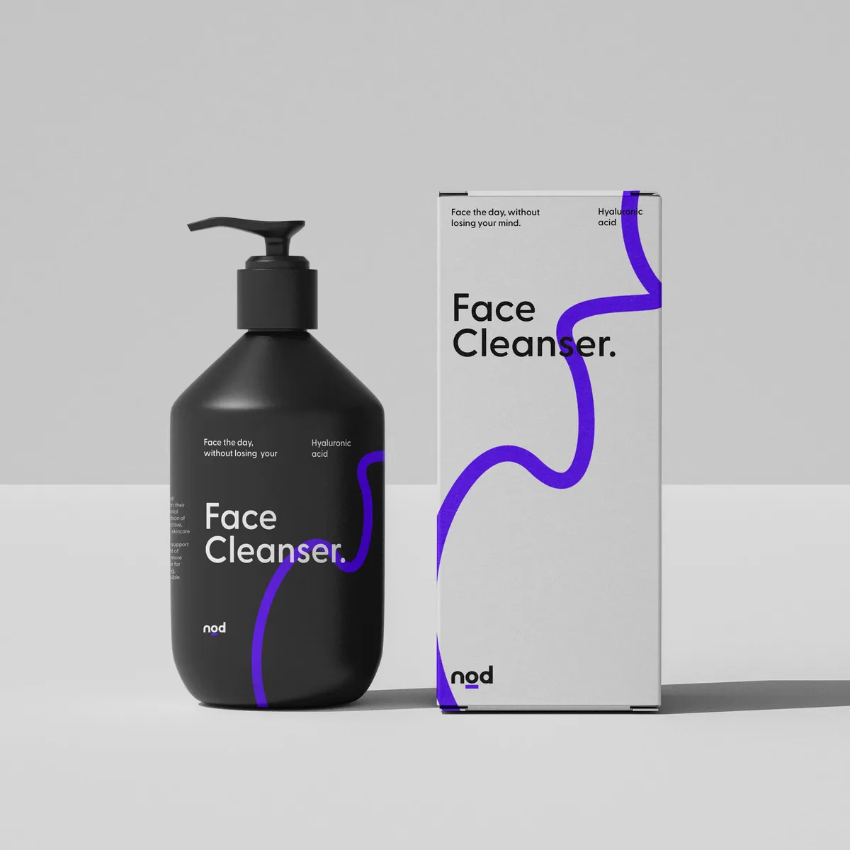
Nod Face Cleanser P and S
Nod Serum Toner Moisturiser Primary
Nod Face Scrub P and S
Nod Face Scrub Primary
Nod Face Toner x3
Nod Face Toner P and S

The approach

Research showed men weren’t buying based on science or ingredient lists, so the identity dropped the jargon in favour of small motivational messages on every product, treating skincare as a habit rather than a chemistry lesson. A simple, sophisticated look replaced the category’s dark default, staying minimal rather than swapping one masculine cliché for another.

Nod Face Cleanser Primary
Nod Face Oil P and S
Marco Bode
Co-Founder | Nod Skincare
Marco Bode

What Nod Skincare said about working with us

"Noramble created the entire brand from scratch for us. We love how they are not just selling a logo or a packaging design; instead, they take you on a process that goes from the research and mapping out concepts to a final product."

Nod Instagram Stories
Nod Logo
Nod Logo 2
NOD Lines
NOD Typography 04
NOD Typography 06
NOD Typography 05
Launched
Brand launched in 2024
Retail Growth
23%
PR Features
Featured in local news and PR

More of our
fave' work