
Yes, your product has to taste good. That’s a given. But in the fight for shelf space and social buzz, taste alone won’t carry your brand, especially when 81% of consumers report trying a new product simply because the packaging caught their eye. Great food and drink brand design is about building a full-on sensory experience before a customer ever takes a bite or a sip.
Branding in the food & drink world has become more than just the product itself. It’s the crunch of a crisp, the pop of a bottle cap, the colour of the can, even the voice on the back of the pack. In today’s market, you need to make people feel something.
Let’s take a look at the brand design trends and branding shifts that are shaping the future of food and beverage brands. We’ll give you the lowdown on how to make your brand one that people crave both visually and emotionally.
People can’t taste your product through a screen, can they?
When you're launching a new energy drink, kombucha, oat milk, snack bar, or plant-based burger, your brand design is doing all the heavy lifting from day one, before anyone’s tried it. You have to compel people to want to try it first. Brand design for drink and food products has to be strategic if it’s going to impact sales.
Here’s what great branding can do that your recipe can’t:
If someone sees your packaging and wants to pick it up, you’ve already won the first battle. Whether or not they come back for round two? That’s where design rolls up its sleeves for a second shift. The thing is, it’s not just about your packaging design. We know branding is more than just a logo; your brand design as a whole needs to make an impact
Imagine someone spots your drink in the chilled section. The label’s loud, the colours are vibey, and there’s a cheeky line of copy that makes them smirk. Into the basket it goes.
Fast forward: they’re sipping it on the train, scrolling Instagram, and *bam* there’s your brand again, serving up recipes, memes, or weirdly specific horoscope pairings with your flavours. The tone matches. The look matches. The vibe is consistent. Now you’re not just a drink, you’re a personality they remember.
Good brand design follows people home into their feed, their fridge, their next grocery list.
That’s the real magic. When your brand feels like a friend, one with good taste and a strong aesthetic game, people stick around.

Packaging is your best-performing salesperson. It’s on the job 24/7, in every retail setting. The design has to resonate with different markets. Whether that’s the wellness aisle of Whole Foods to the fridge at the corner shop. The brands winning hearts today are leaning into a few big visual trends to watch in 2025:
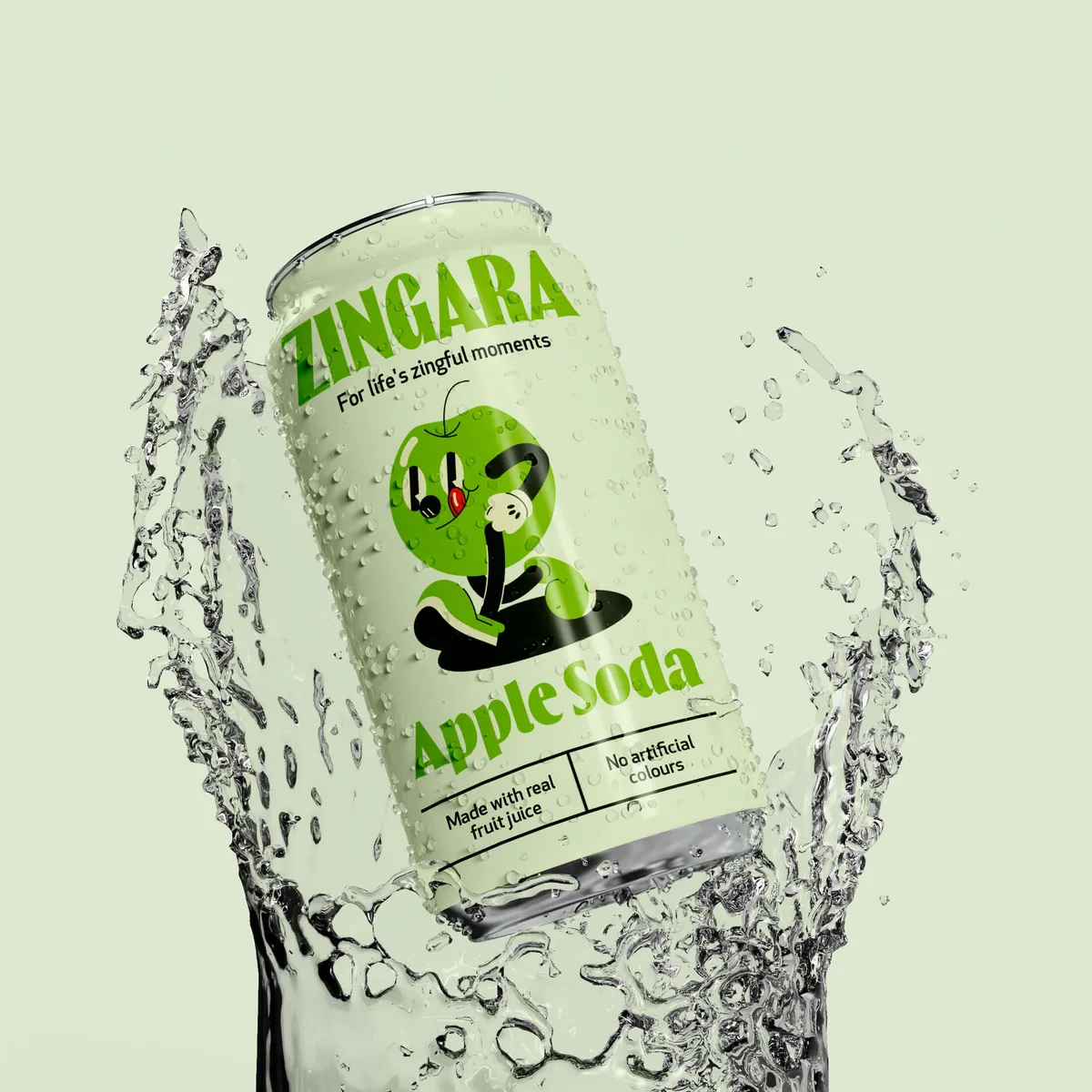
Think punchy pinks for hot sauces, deep greens for matcha brands, or neon blues for sparkling water. Loud is in, especially if it makes a product easy to spot from across the store. Not enough people are disrupting their categories. Colour differentiation is one way you can do this.
Fonts that feel less ‘perfect’ and more ‘crafted’ for the brand are having a moment. That’s the role of typography in packaging. It can give an approachable, indie feel that customers associate with honesty and small-batch quality. Especially ideal when crafting an identity for artisanal products.
Minimal packaging, earth tones, and recycled textures immediately speak to the sustainability-savvy shopper and can help when budgeting for packaging design. Think about choosing sustainable packaging substances for your product. Just make sure it’s authentic, as greenwashing is easy to suss out these days.
Fun shapes, photogenic unboxing experiences, quirky copy, or layered packaging. If it makes someone want to share it online, you’re winning.
In the age of “first sip” reviews and “taste test” trends, your product can become content. TikTok, especially is full of people trying out new snacks, rating drinks in their cars, or reacting to that “weird new flavour” with something like 100k+ views.
Design that’s social-media-friendly invites participation and is brilliant for getting feedback on packaging design. That’s user-generated content (UGC), and guess what? It’s free, it’s authentic, and it spreads like wildfire when done right.
So ask yourself: would someone want to film their first taste of your product?

So, someone picked up your product. Maybe they loved the taste. Maybe they just liked the look of it. Either way, congrats – you made it into their hands. Now comes the real work: getting them to remember you, trust you, and come back for more.
This is where smart, consistent brand design starts doing the heavy lifting.
This is more about how your brand shows up in their world. On Instagram, in an email, on a billboard they pass every morning, or in a TikTok that goes mildly viral.
Here’s how small, thoughtful brand design choices build customer loyalty over time:
This creates instant recognition. It might be from your packaging or social posts to point-of-sale displays. Whatever it is, people start to associate certain colours, typefaces, or illustration styles with you, which builds trust without saying a word.
Oatly is a masterclass in consistent visual branding. Whether you’re staring at one of their oat milk cartons, scrolling past an Instagram ad, or walking by one of their billboards, you instantly know it’s them. Their use of bold, hand-drawn typefaces, scribbly illustrations, and conversational copy is so consistent, it doesn’t matter if there’s a logo on it or not; it feels like Oatly straight away. This tight visual system has helped them build a major following and a strong shelf presence in a category that used to feel, well… very beige, very vanilla.
By sticking to their design language religiously (but keeping the content fresh), Oatly has built not just recognition, but trust. The kind that turns a one-time try into a fridge staple.
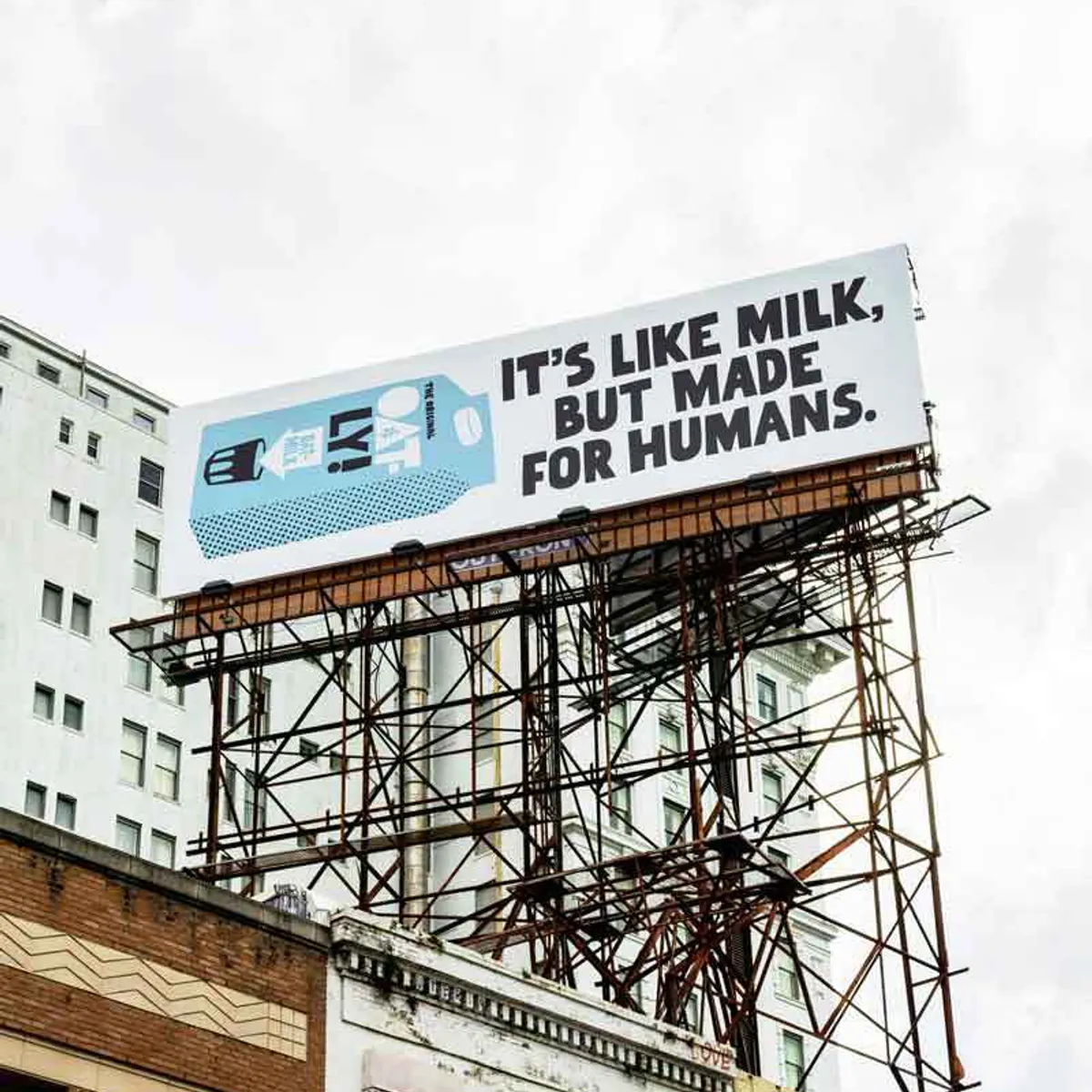
Image source: Oatly.com

This can create a connection between brand and consumer. Maybe it’s a witty line on a poster, a surprise recipe card in a delivery, or a relatable meme on your feed.
These little moments make your brand feel human, not like a faceless company. That’s why so many brands have shifted the way they talk. It’s because we know people don’t just buy products, they buy personalities. When your brand sounds like a real person (with opinions, humour, and good taste), it becomes easier to trust. And once trust is there, loyalty follows close behind.
Now, Ryanair might not be the first name you’d think of for brand warmth, but its social media strategy proves how far personality can go. They’ve taken what could be a dry, budget airline brand and turned it into a meme machine. From self-deprecating TikToks to brutally honest Twitter replies, Ryanair leans hard into its reputation, and people love it.
They’re not pretending to be luxury. They’re not trying to please everyone. They’ve built a voice that’s completely self-aware. And that’s what makes them stand out.
By embracing their flaws, exaggerating them even, Ryanair has created a brand persona that feels real. You may still complain about legroom, but they’re ready to terror you back for it. That’s emotional engagement and that’s where brand loyalty starts.


People don’t just want to buy from brands anymore; they want to feel like they belong to them. That’s where smart, personality-driven brand design can create a sense of insider-ness – like being part of an exclusive club.
One way to do this? Inside jokes and cultural nods woven into your brand language and visuals. Think captions that reference oddly specific cravings (“best enjoyed standing in front of your fridge at 11:47 pm”), or reactions to internet culture in your design. These moments say: “Hey, we get you.” and that’s exactly what people are looking for these days.
Another way is through limited-edition drops or unexpected collabs. When a brand partners with an influencer, indie artist, or even a niche online creator, it creates something fresh and shareable.
And then there’s playful community engagement. This could be inviting your followers to vote on the next flavour, featuring user-generated content on your feed, or designing packaging with your customers (hello, crowd-sourced labels). It shows your brand isn’t talking at people, it’s talking with them.
On Manchester derby day, after City beat United 3–0, Domino’s dropped an iconic Instagram post that read: “Sorry if your pizza is delayed tonight – our drivers are struggling to get through the floods of United tears.” Brutal (for all the United fans out there, sorry if that’s you 😂). But also... brilliant.
To top it off, they added a poll to the caption: “Manchester is…” with two options – Red or Blue. Over 4,500 people jumped in. Some to gloat, some to grumble, but all totally engaged.
This is a timely, culturally relevant joke designed specifically for people in the know. No explanation needed. Just a sly nudge that says, “We’re watching too.” And by turning it into a poll, they invited the audience into the moment. That’s how you build a brand that feels alive, local, and genuinely part of the conversation.
At the heart of all this is one simple truth: people love to feel seen. When your brand design makes someone feel like they’re part of the joke, the drop, the process, or the culture… you’ve got more than a customer. You’ve got a fan.

Image source: instagram.com
Let your brand stay fresh without losing its identity. You can experiment without confusing your audience if your design foundation is strong. You’re still recognisably you, just with a little twist. That’s exactly how seasonal or campaign-specific tweaks work in brand design.
These are the fun, time-sensitive changes that let your brand stay relevant and fresh. The key is to stay rooted in your brand’s design language so your audience doesn’t feel like you’ve shapeshifted, just evolved
None of this requires a full rebrand. It’s about tightening your brand world and building a cohesive brand design, making sure that wherever someone encounters you, they get the same energy, values, and vibe.

You’re not just competing with other products in your category. You’re up against family traditions, TikTok taste tests, wellness influencers, and that nostalgic snack from someone’s childhood, which is why vintage-inspired packaging design can be so powerful. Your audience is making choices based on emotion, values, aesthetics, trends, and vibes, not just flavour.
That’s why your brand needs to feel like a lifestyle. Like a friend. Like a club people want to be part of.
When your brand design captures someone’s attention and aligns with how they see themselves – fun, sustainable, health-conscious, rebellious, premium, whatever it is – that’s when they start sticking around. That’s how loyalty is built. Not just with discounts or clever packaging design, but with consistent, emotionally-driven design that shows up everywhere they look.

Remember this: brand design is the experience.
The fonts you choose, the colours you repeat, the tone of voice on your captions, the photos you use, the way your product looks on a billboard at 8AM – it all contributes to how people feel about your brand. And in a crowded food & drink market, feeling something is what gets people to choose you.
In this space, you’ve only got one shot to make someone crave you, make it unforgettable. We’re here if you need help with that 😉.


