
When it comes to packaging design, what you say matters but how you say it visually might matter even more. Typography isn't just about picking a font you might like; it’s about setting the tone, building trust, and creating that crucial first emotional hook for buyers scanning crowded shelves.
Choosing the right packaging fonts could be the difference between a product that gets thrown into someone’s shopping cart... and one that quietly gathers dust on the shelf. With font psychology playing a bigger role than ever in branding decisions, getting your typography right is essential. Trust us, we know.
Before you get dazzled by a trendy typeface, take a step back. The right font should reflect your brand’s soul – not just look good in isolation.
If you’re a luxury skincare brand, you probably want something timeless and refined – maybe a classic serif with subtle flourishes. On the other hand, if you’re launching a playful snack line for kids, you’re looking at lively, chunky lettering or handwritten fonts that shout energy.
Ask yourself: does the font feel like you? Does it capture your product’s personality? Fonts carry emotion, and emotion drives buying decisions. One more thing: don’t just imitate what’s already out there. Great brands carve out their own space – and your typography should help you do exactly that.
Understanding basic font families can save you a lot of second-guessing:
Choosing fonts from the right category already tilts perception in your favour.
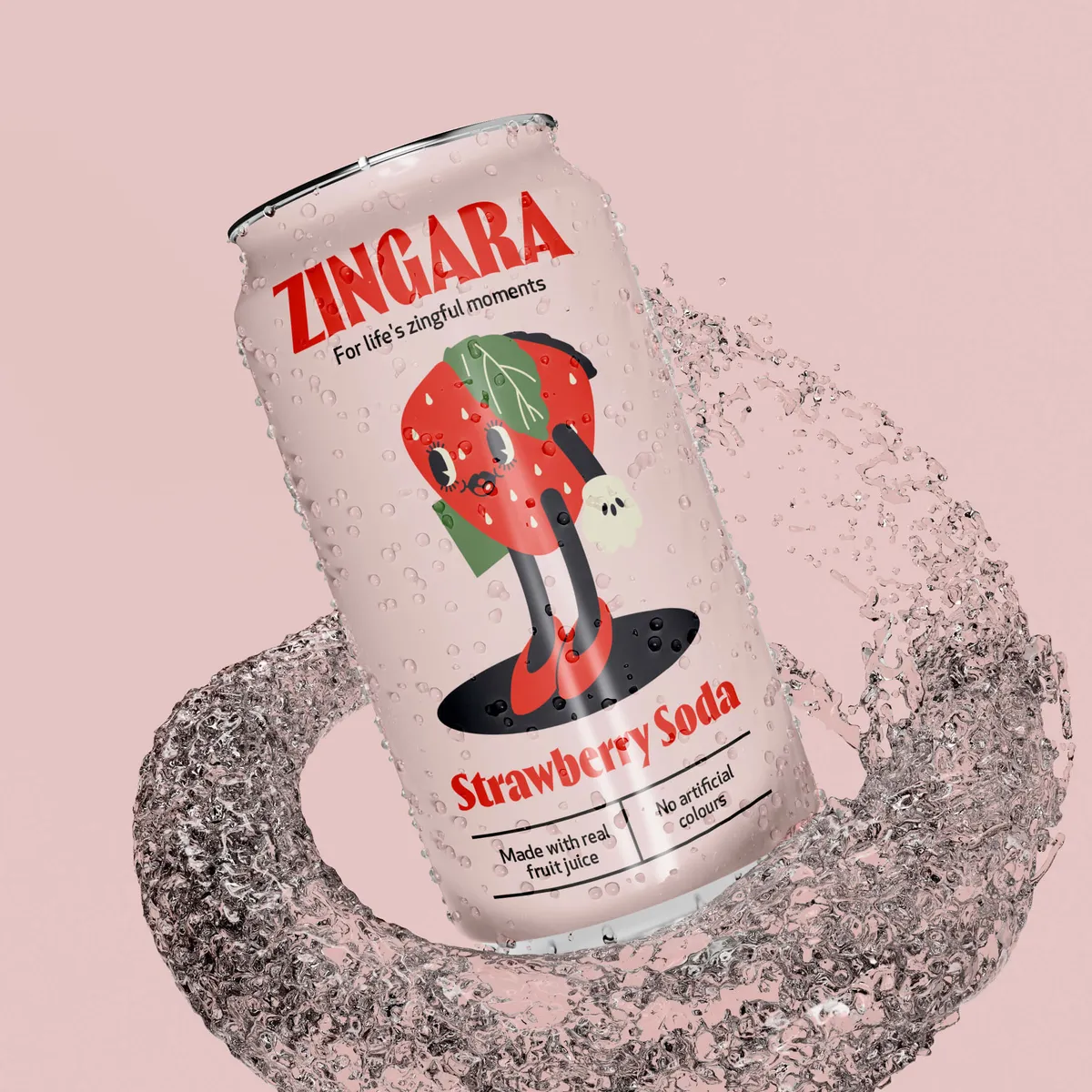
At Noramble, we see this in action every day. For example, when designing for Zingara, a modern-retro drink brand, we chose Thrillers Black – a bold, nostalgic typeface that brought a playful but stylish edge to the packaging.

Meanwhile, for Nod Skincare, a brand built around simplicity and calm, we selected Greycliff CF – a clean, minimalist sans-serif that let the product’s purity shine through without shouting for attention.


Typography isn’t static. Like fashion, it evolves with culture. Here’s what’s currently lighting up the packaging design world:
Each trend reflects broader consumer moods – whether that’s a craving for authenticity, simplicity, or memorable boldness.
Fonts do more than look stylish; they change how your product is perceived. A minimalist font says "modern, trustworthy, premium." A vintage font says "heritage, authenticity, tradition." A playful handwritten font says "fun, accessible, creative." Ignoring typography in packaging design trends risks your brand looking outdated – or worse, invisible.
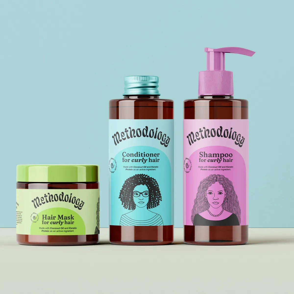
Take Methodology, a high-performance haircare brand with a fun, laid-back edge.
When Noramble designed their packaging, we chose Lafleur – a bold, confident serif font that added structure and impact without feeling overly serious.
To balance this strength, we paired it with vibrant colours and playful secondary typography, creating a brand identity that feels accessible, energetic, and customer-focused. The bold typeface made an instant impression, giving the packaging strong shelf impact while still reflecting Methodology’s philosophy: high-performance haircare, no compromise, no pretension.

For Cane, a minimalist toothbrush brand inspired by natural materials, Noramble combined Eldwin Script with Bebas Neue Pro – pairing soft, flowing typography with clean, structured lettering.
This contrast reflected Cane’s philosophy perfectly: simple, honest design with a subtle human touch, creating a calm, paired-back identity that feels both modern and natural.

Fonts don’t just carry messages; they trigger emotions almost … almost instantly. Studies show consumers form first impressions within 50 milliseconds, and much of that gut reaction is visual. On a supermarket shelf packed with noise, the right typography can make a customer feel excitement, nostalgia, trust, or luxury – all before they even read a word. Think of typography as the visual tone of voice. Pick wisely, and it speaks straight to the subconscious.
Typography and colour psychology are like a brand’s visual voice and mood combined and they’re far more powerful together than alone. When both elements are carefully aligned, they create an emotional reaction almost instantly.
Imagine a classic serif font in a calming navy blue. It speaks tradition, trust, stability – great for heritage brands, finance, skincare, or wellness. Now flip it: a chunky, playful display font in neon pink? It screams creativity, energy, and fun. Perfect for youth brands, fashion drops, or indulgent snacks.
Why does this matter? Because consumers make judgments about products in mere seconds (often subconsciously) based on colour and typography cues. Fonts shape perception (serious vs. playful, modern vs. traditional), while colour stirs emotional response (calm vs. excitement, luxury vs. affordability).
When these two elements work together strategically, packaging connects emotionally. It helps consumers feel something about your brand before they’ve even processed what you’re selling. It builds instant associations: trustworthy, exciting, premium, natural – whatever you need them to believe.
In short? Good colour and font choices tell the story for you — silently, instantly, and memorably.
Typography is one of the most powerful (and underrated) tools in packaging design. The right font doesn’t just "look alright"; it creates an emotional connection, shapes brand perception, and can be the secret ingredient that makes your product impossible to ignore.
When you choose wisely and design intentionally, your packaging won't just sit there – it’ll speak, shout, or whisper exactly what you want your customers to feel.
Want packaging design that works for you? Get in touch with us and let's bring your brand design to life with standout typography that leaves a lasting impression.


