Fine Fettle has been a market leader. However, they began to lose market share to new entrants. They needed to revamp their brand to regain their once prominent position.
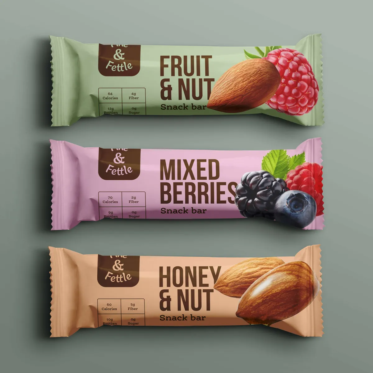
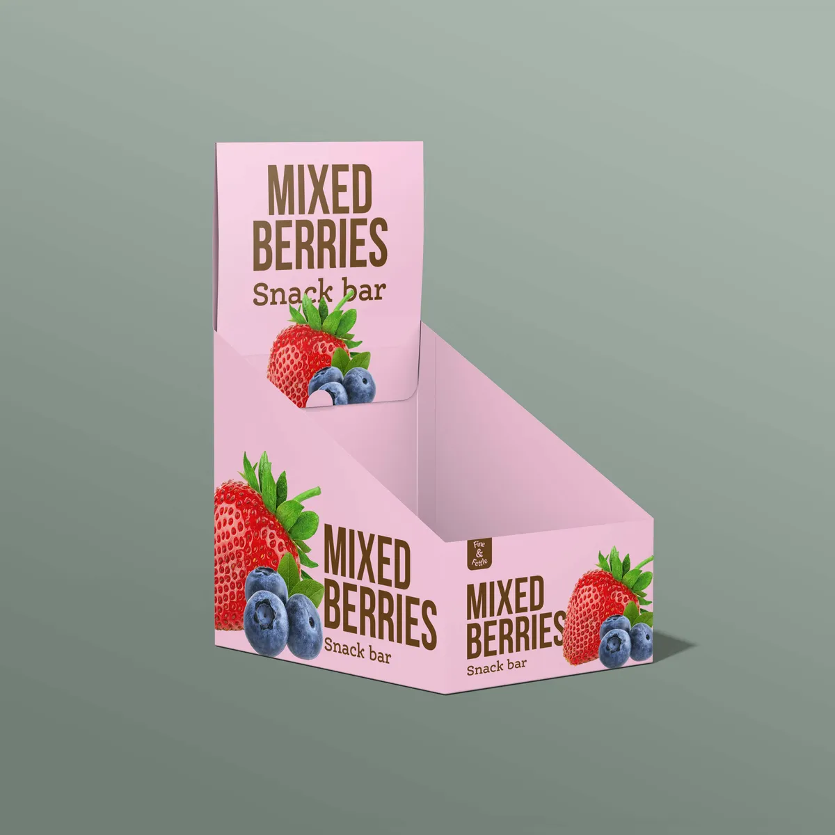
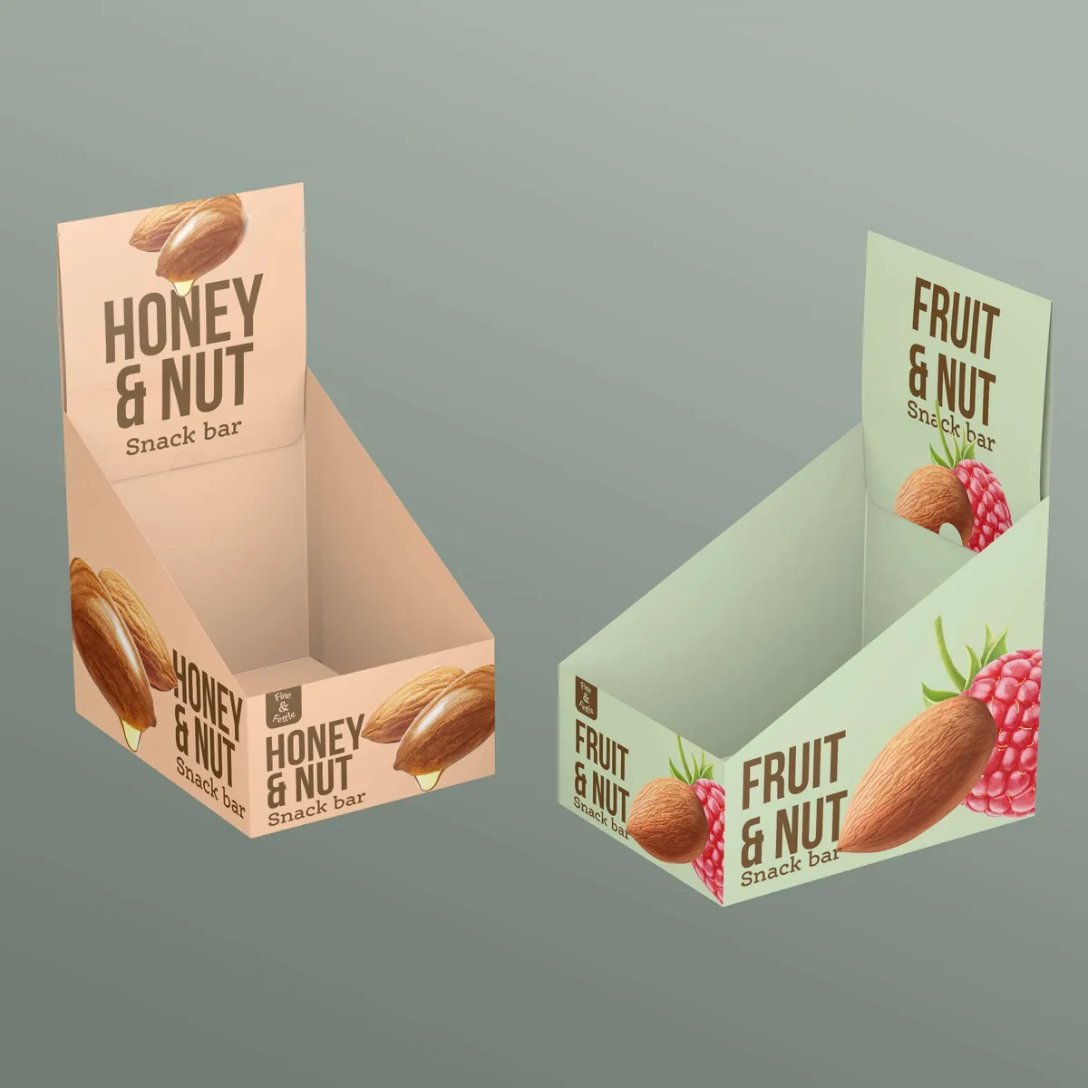
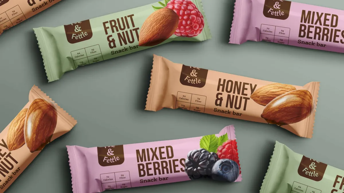
We put flavour and health at the forefront, which is why customers love the brand. We increased the colour saturation to create impact and created illustrations to help build brand recognition with consumers. We switched the packaging hierarchy to focus on the product and give people what they wanted.