
Bad brand design isn’t just a visual issue; it’s a business problem, one that affects sales more than you think. From the moment someone lands eyes on your packaging, website, or ad, they’re making snap judgments about your credibility, quality, and relevance. If your brand looks generic or inconsistent, that doubt creeps in immediately. And once it’s there, it’s hard to shake.
Think about a brand you genuinely love for a second. One you actively notice. Chances are, it didn’t win you over by being safe or boring. It caught your eye first. Maybe it was the packaging that felt cool, the colour palette that stood out, or the way everything just looked… intentional. You clocked it instantly, even if you didn’t realise it at the time.
Now flip that. Brands with bad design don’t just look a bit off; they become invisible. Completely irrelevant. Walk down any supermarket aisle, and you’ll see it in real time: hundreds of products sitting there, technically available, but effectively ignored. The amount of stuff that goes unnoticed purely because of weak branding is honestly ridiculous. It’s not always that the product is bad; it just never earns that first glance.
Good design earns attention without asking for it. Anyone can appreciate when something looks good because it triggers that quick mental note: “that’s interesting”, “that looks premium”, “I’d try that.” That’s what you want for your brand.
Once you’re overlooked, you’re competing on price by default. Because if people don’t notice you, they’re definitely not choosing you for your brand. This article breaks down the real commercial cost of getting it wrong. Let’s roll with it 👇.

Before anyone reads your product description or checks your reviews, they look – and no, not just at your logo … they’re looking at everything. And that first impression does a lot of heavy lifting.
Brand design acts as a shortcut for credibility. Whatever it is – clean typography, cohesive colours, structured layouts, and confident packaging – these all signal that a business knows what it’s doing. On the flip side, inconsistent visuals, clashing styles, or poor execution raises questions instantly.
People don’t separate design from the business itself. If the brand looks uncertain, they assume the company is too.
Consistency in design creates trust and you’ll find that when you nail this, you’re a step closer to having a cohesive brand. When every touchpoint feels aligned, it reassures customers that the brand too, is stable and reliable. That’s the real brand design importance: it reduces perceived risk before a product is even touched.
In categories packed with similar products, that reassurance becomes a competitive advantage. Strong packaging and identity systems act like trust shortcuts, helping people make quicker, more confident decisions.
This is exactly where working with a brand and packaging design agency can help to shift a brand from “just another option” to something people instinctively trust.
When design falls short, customers don’t articulate it in design terms. They translate it into business judgments:
That’s the hidden damage. They just leave.
And most importantly: blending in doesn’t build trust, it dilutes it. Take a look at one of our recent projects: Flavadent.


Customers don’t wait to try your product before forming an opinion. They build it instantly from visual cues.
When design is done right, all of these signals align. When it’s not, the perception becomes fragmented or worse, underwhelming.
A great product with weak design often gets labelled as average. An average product with strong design? That can look like a category leader. That’s the power of brand design.
A big part of the cost of bad branding: it drags perception down, regardless of the actual quality.
| Design signal | Likely customer perception | Commercial effect |
| Generic visuals | “This looks like every other option” | Weak differentiation |
| Inconsistent messaging | “I don’t quite get what they do” | Lower conversion |
| Cheap-feeling packaging | “This must be low quality” | Lower perceived value |
| Outdated identity | “This feels behind the times” | Reduced relevance |
| Category clichés | “Nothing stands out here” | Price-led comparison |
Take a walk down any supermarket aisle and you’ll see it:
Individually, these choices feel “safe.” Collectively, they erase distinction. With clients, we often get told: “We want to stand out. Be the flamingo in the room.” But here’s the problem: what if the room is already full of flamingos? That’s exactly what’s happening in most categories. Everyone’s chasing the same trends, copying the same visual cues, following the same playbook. So instead of standing out, you get a lot of noise… and no real attention.
If every brand is loud, bright, and trying to grab you, none of them are memorable. You don’t win by being a slightly better flamingo. You win by being the penguin.
Something unexpected. Something that breaks the pattern. Something your brain actually registers because it doesn’t look like everything else.
Right now, too many brands are designing for approval instead of attention. They blend in, play it safe, and end up invisible on the shelf. Invisible brands don’t get chosen.
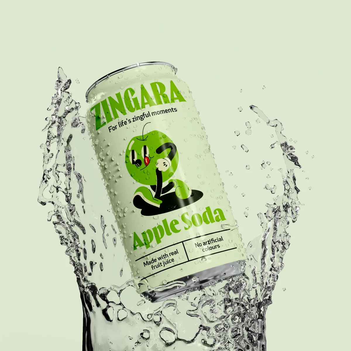
Take a look at our Zingara project, we loved working with this client and we're really proud of the work we delivered.


If your brand doesn’t look distinctive or valuable, customers struggle to justify paying more for it. It’s that simple.
Strong branding builds perceived value. It gives people a reason to believe the product is worth a premium. Weak branding removes that reason.
So what happens? You start competing on price.
That’s where the brand design importance becomes painfully clear.
Once a brand slips into price competition, it’s difficult to climb back out. You’re constantly being compared.
Strong design, on the other hand, supports differentiation. It helps customers see why you’re different, why you’re better, and why you’re worth paying for.
Brand design is doing serious commercial heavy lifting, whether you realise it or not:
Design is your positioning. If you get it wrong, you’re instantly reduced to a commodity. Just another option in a sea of similar products, fighting on price.
But if you use it right, you become the obvious choice.

Bad brand design can actually come from having a communication problem. We’re talking about when what you say and how you look don’t align. When something doesn’t make logical sense and there’s a mismatch between design and communication, customers notice. Not consciously, but enough to hesitate.
Common mismatches include:
These contradictions create friction which naturally slows decisions.
If customers have to work this hard to understand you, they usually won’t bother.
Every brand touchpoint should reinforce the same idea:
When these elements work together, the brand feels clear, and customers can place confidence in you. When they don’t, it feels uncertain. Clarity is about saying the same thing, consistently, in every form.
And this is where many brands fall into the “random creativity” trap. They try to stand out visually without a clear strategic foundation. There’s no point trying hard to make something look different or bold if it’s meaningless.


Tropicana’s 2009 packaging redesign is one of the most cited branding missteps and honestly, it's fair enough. The redesign stripped away key recognisable elements like the iconic orange-with-straw visual. In its place came a cleaner, more generic look.
The problem wasn’t that it looked bad. It’s that it looked like everything else and nothing like what Tropicana was known for.
Customers struggled to recognise the product on shelves (major red flag!), and sales reportedly dropped by around 20% in a short period. The company reversed the redesign quickly but not before significant losses. Let this be your sign to know that if it ain’t broke, don’t try to fix it.
Lesson: When you remove distinctive brand assets, you remove recognition. And recognition drives purchase.

Image source: thebrandingjournal.com
In 2010, Gap introduced a new logo which some would describe as a cheaper Helvetica design. It lasted about a week.
The backlash was immediate and widespread. Customers didn’t just dislike the design, they rejected what it represented: a break from familiar brand equity. They lost customers and it had a negative impact on the brand’s reputation.
Gap reverted to its original logo within days.
Lesson: Branding isn’t just visual, it’s also emotional. You can’t ignore the memory structures people already associate with your brand.

Image source: thebrandingjournal.com
The takeaway isn’t “never change.” It’s just “don’t refresh your brand blindly.”
The real risk is undifferentiated redesign.
Brands that succeed strengthen what they already have and hold onto the parts that are recognisable and meaningful.
That’s the difference between rebelling in the right way and just… redesigning for the sake of it.

Following category norms feels safe. It reassures internal teams that the brand “fits.”
But from a customer’s perspective, it makes you invisible.
When every brand uses the same cues (same colours, same layouts, same tone) there’s no reason to notice any of them.
That’s the real problem with category clichés: they reduce your chances of being chosen.
Or to put it simply: if you look like everyone else, why would anyone pick you?
Good branding is about being different in a way that makes sense.
That means:
When these come together, design stops being surface-level work and starts driving real growth.
And yes, this is exactly where brands that actively rebel against category cliches tend to outperform the ones playing it safe. But in order to do that, you might want to invest in a brand design agency like Noramble to spot where the category gaps are.


Bad brand design is expensive but not always in the most obvious ways. It quietly erodes trust, weakens perception, reduces pricing power, and leaves customers unsure why they should choose you.
In competitive markets, that’s a serious disadvantage.
The strongest brands are often the ones that choose to be clear on who they are and what they stand for from day one. They’re the clearest, most distinctive, and most memorable. When design gives people a reason to notice and believe in a brand, it starts to become a growth tool and soon you’ll realise that investing in brand design was the smartest business investment yet.
If your brand looks a bit too familiar (in a bad way), it might already be costing you. Noramble helps brands stand apart without losing their strategy in the process. Worth a look before your competitors figure it out first. Get in touch with us.


