
Great product? Sure. But the brand? Zero legwork. The thing is, consistent branding can boost revenue by 10–23% with some brands seeing over 20% growth just from showing up the same way, everywhere. Brand design can seriously impact sales for the better.
The competition out there is fierce. Just looking good won’t cut it. You have to go deeper; the design has to work for you. It takes strategy, consistency, and a little willingness to poke the edges of what’s expected. Whether you’re building a brand from scratch or trying to bring life back to something that’s started to feel a bit...meh, these are the 10 brand design rules we actually use at Noramble to help brands stop blending in and start turning heads.
Your brand’s visuals should tell your story – not your competitors'. If your brand is bold, wild, and flavour-packed, don’t dress it up in calm, corporate beige because it feels “safe.” That’s how you end up looking like everyone else on the shelf. You’ve got to visually match who you are as a brand.
Takeaway: Start with figuring out your brand personality. Then translate that into shape, tone, texture, and colour. Not just what’s trending. Or even better, partner with a brand design agency that gets it and can help you get to where you want to go. Noramble is a go-to brand agency for businesses.


Scrolling through brand designs can feel like déjà vu. Another pastel DTC skincare brand. Another “clean” sans-serif wellness thing. Another script font kombucha. The problem? If people can confuse you with someone else, they will. Don’t let them put you in the wrong basket, forget you five seconds later, or scroll straight past you without a second thought.
Be different on purpose. But not for the sake of it – make sure it makes sense for your brand. Even slightly weird is better than completely forgettable. You have to find the gap and own it hard. That could be through colour, tone of voice, format, or whatever unexpected detail that makes people stop and go,
“Wait... what’s this?”


We get it – you might be emotionally attached to certain design elements that just aren’t pulling their weight anymore. That extra colour “just in case”? The tired, old font you started with? We’ve all been there.
But now’s the time to be ruthless.
Great brand design isn’t about adding more. It’s about knowing what to strip away.
Because clarity beats clutter, every time.
If you’re too close to it (which, let’s be honest, you probably are), get an outside perspective. A good design agency won’t just tell you what looks good – they’ll tell you what actually works, even if it stings. This is what we like to call creative criticism – it will benefit you long term.
Let’s look at it this way – If someone can’t sketch your logo from memory or recognise your pack on a crowded shelf in two seconds flat – it’s probably too complicated.
Simple = sticky.
It’s the stuff that lives rent-free in people’s heads.
Think of it this way: some of the best web designers in the world don’t obsess over bells and whistles – they obsess over usability. How fast something loads. How easy it is to navigate. Where the eye lands first.
Brand design is the same. Overcomplicating things – with too many colours, fonts, taglines, textures, “statement” flourishes – doesn’t make you look clever. It makes people tune out. Or worse: confused.
And confused = gone.
We’ve had clients ask, “Should I make the logo bigger so it stands out more?”
No. Absolutely not.
That’s not standing out – that’s crying for attention. And brand design is so much more than just your logo.
Big doesn’t mean bold. Loud doesn’t mean memorable. The best brands know when to take a back seat on design.
Less isn’t boring. Less is clarity. Less is confidence.


Colour is psychological warfare (in a nice way). Bright colours tend to attract. Monochrome can have a calming effect. Pastels soothe and neon screams. Colour is one of the fastest ways to trigger emotion, signal meaning, and stick in someone’s memory. And yet, far too many brands choose their palette like they’re picking out some wallpaper. (“We liked the vibe…”) No. Colour needs to work.
According to research, up to 90% of a consumer’s first impression of a product is based on colour alone. Yep so that’s before they’ve read your tagline, registered your logo, or even clocked what you actually sell, they’ve made a snap judgement based on your colour palette.
Let that sink in.
Use a maximum of 3 colours and make sure they actually mean something for your brand. If you want to look premium, maybe don’t lean into the colours associated with the likes of cartoon cereal colours or packaging for children. If you want to disrupt, go bold.
Different colours also carry cultural associations, which means what's bold and confident in one market might feel cheap or overwhelming in another. Know your audience.
And let’s not forget accessibility. That dreamy pastel pink might look cute on your mockup, but if your text disappears against it, you’ve just sacrificed usability for aesthetics. Never worth it.
Oh and a quick cost-saving bonus: using fewer colours can reduce production and printing costs and can cut waste if you plan it properly, especially for packaging. And if your packaging is changing anyway, it’s worth knowing what’s actually possible now with eco-friendly packaging. Because “production” isn’t just pounds and pence — it’s carbon footprint too. If you’re not sure what counts as sustainable vs greenwashed, start with the basics of sustainable packaging.


Let’s just say it: thick bodies of text are not a vibe. Imagery overload? Also not a vibe. A label crammed with five fonts, three taglines, and a paragraph about your founder’s childhood? Again … not a vibe.
White space (a.k.a. blank space) is your friend. It’s the design equivalent of confidence, like saying “we don’t need to shout, you’ll notice us anyway.”
Cramming every inch of your layout with stuff doesn’t make your brand look premium or informative, it just makes it look panicked. Like you're trying to win the customer's attention with a firehose of information. Spoiler: you're not.
The best brands know what not to say. What not to show.
That restraint? That’s power.
So don’t fill space for the sake of it. Use it on purpose. Let your visuals breathe, and your message will land way harder.


Great branding should always makes you feel something.
Whether that’s trust, nostalgia, humour, or a deep and sudden craving for chilli oil, emotional resonance is what makes brands memorable. And it doesn’t have to be loud. It just has to be human.
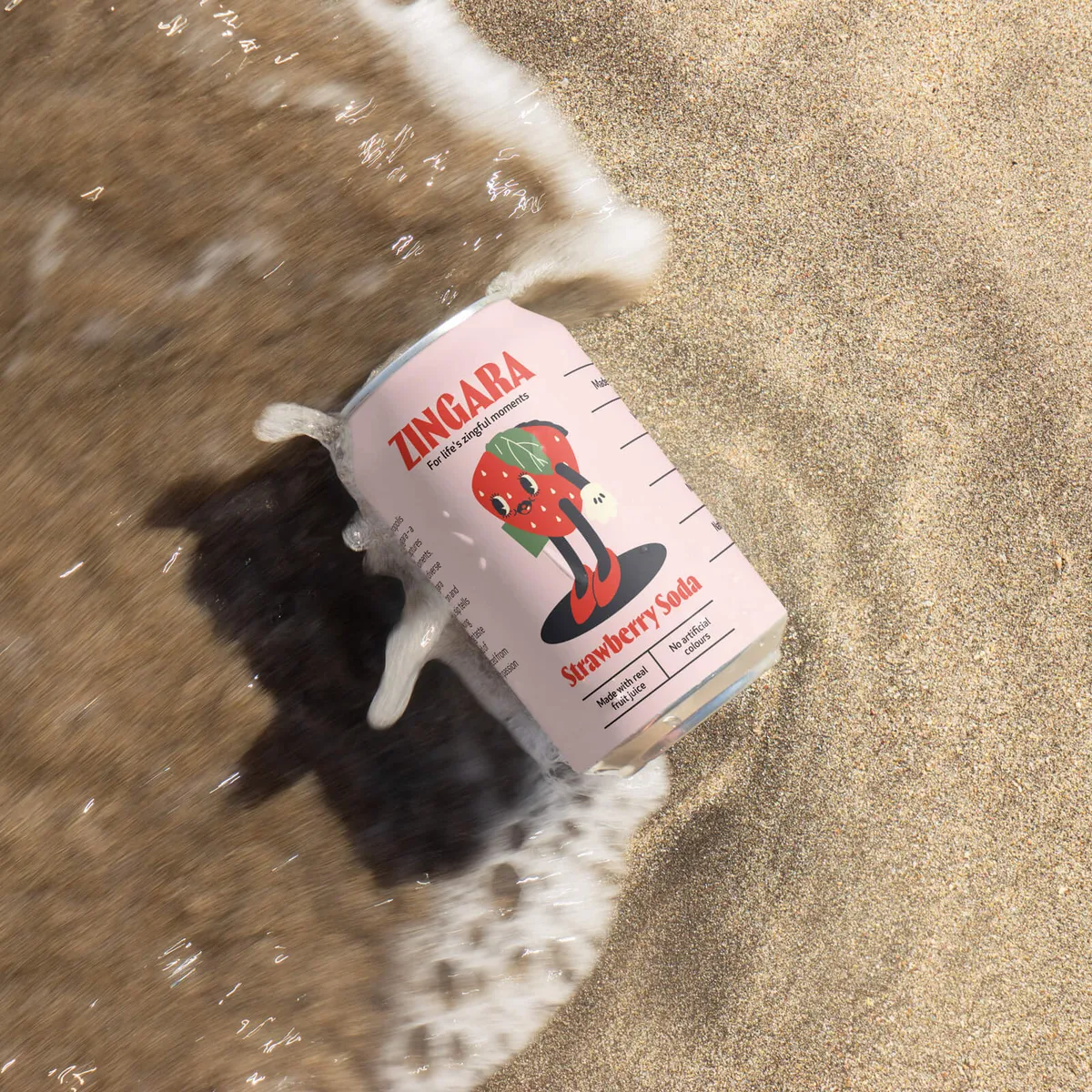
Take Zingara, a soda brand we worked with that wanted to bring retro flavours back into the mix but without falling into cliché. We built a modern-meets-nostalgic identity full of playful flavour mascots, juicy typography, and vibrant colours that practically fizz off the label. We wanted to create a sensory experience that instantly felt familiar but fresh.
The mascots served as memory hooks. A bit weird. A bit cheeky. And designed to evoke that nostalgic buzz of old-school sweet shops and corner store treats.
That’s what emotional branding does:
It adds warmth to your visuals. Personality to your product. A feeling that sticks.
Emotion doesn’t always need to shout. You can add it in:
Information tells. Emotion sells.


Here’s one we actually use with clients: open your Instagram feed or online shop. Scroll fast.
Which brands still catch your eye? Which ones disappear?
Your brand has milliseconds to make an impression. If your logo, packaging or ad blends into the background – you’ve lost. Harsh but true.
Design to disrupt the scroll. If you’re not making an impact online, it might be a sign your brand design is holding you back.

Your logo might look fire, but if your social media posts, packaging and tone of voice all feel like they’re coming from different planets? People won’t trust you and will forget you ever existed.
Cohesion is an extremely powerful branding tool. It builds recognition, trust and that oh-so-valuable sense of “I’ve seen this before.” So here’s your sign to build a cohesive brand.
Your brand should feel like one person speaking and one person only.

This is where it's at. This is where “good” brands become known brands. And yes, this is where we get a bit evangelical, because distinctive brand assets are the main characters when it comes to branding.
It’s about creating a set of recognisable, repeatable brand cues (visual or verbal) that make people go, “Oh yeah, that’s them.” Without needing to read the label. Without seeing the name.
These assets are your mental shortcuts. Your visual signatures.
The things that burn your brand into people’s brains and make you unforgettable.
We’re talking:
These are your memory hooks. Build them. Repeat them. Own them.

Good design fades fast without consistency. A brand book is a living reference guide to make sure your brand shows up right every single time.
Include rules on:
Even if you’re a tiny startup – start documenting it early. Future you (and your future agency) will thank you.

At Noramble, we’ve seen it time and time again: the brands that win aren’t always the loudest or flashiest. They’re the ones that know who they are, and express that clearly, consistently, and confidently across every single touchpoint.
Want to do the same?
We help brands do this on purpose – whether you’re starting from scratch or ready for a well-timed brand glow-up. We’re here. Get in touch.


