
You know when you're scrolling through Instagram or wandering around a shop and you spot a product that makes you stop and think, "Ooh, that's cool. What's that?" We love those moments. We look for them all the time.
It could be anything … a drinks can with an unexpected design, a beauty product that looks nothing like the rest of the category, or a food brand with packaging so full of personality you almost want to buy it just to keep the box. That’s packaging design doing its actual job!!! Stopping people in their tracks. When it's done well, it has the power to turn something completely ordinary into something people actually get excited about.
BUT here's what we find so disappointing. For every brand out there doing something seriously cool, there seems to be another ten playing it painfully safe. And trust us, we're looking 👀. At Noramble, we're constantly on the prowl for brands doing something different. The ones challenging expectations, having a bit of fun and giving us something worth talking about.
There are some brilliant examples out there. But there are also far too many brands borrowing the same ideas and jumping on the same trends. Somewhere along the way, packaging design became less about challenging expectations and more about meeting them.
Competitors became inspiration. Trends became templates. And category conventions became rules that nobody remembers agreeing to. But surely packaging design should be doing the complete opposite right?
We're not saying every product needs to be absolutely bonkers. Sometimes doing something unexpected can actually mean just stripping everything back when the rest of your category is shouting. You just need the confidence to do what feels right for your brand, rather than what everyone else is already doing.
Because when everyone else is zigging, why the hell would you want to zig too?


There's a familiar pattern in the packaging design industry. A successful brand launches something distinctive in its own right. It catches attention, gains traction and starts influencing the category. Then what does everyone else do? They follow. Like sheep 🐑.
One brand introduces earthy colours and understated typography. Suddenly, half the category looks like it was designed the same. Another adopts bold, oversized lettering. Before long, every challenger brand is doing the same.
And look, we get it. Businesses want reassurance that their packaging will work, and looking at successful competitors feels like a sensible place to start. But there's a huge difference between understanding a category and copying its visual language.
The problem begins when brands treat established conventions as instructions rather than something worth questioning. Instead of asking what makes their brand different, they ask what successful competitors are already doing. And that, friends, is how originality gets replaced by familiarity.
Look across different industries and the similarities become painfully obvious.
None of these approaches is inherently wrong. The problem is what happens when everyone uses them.
Four familiar habits are particularly good at making packaging disappear:
The irony is that brands often adopt these conventions because they want to look credible, but credibility shouldn't come at the expense of identity.
Understanding how to differentiate your brand design means recognising the difference between belonging to a category and disappearing into it. Your packaging should help people understand what you're selling. Not confuse you with the brand sitting next to you.

There's a reason category conventions exist.
Consumers use familiar visual signals to make quick decisions. Colours, shapes, imagery and typography can help them recognise a product without having to examine every detail. That familiarity has value. You know this … we know this. But there's a point where familiarity becomes a liability.
If your packaging looks exactly how consumers expect every product in your category to look, what gives them a reason to remember yours? That’s when you step into forgettable territory, and nobody wants that for their brand now do they? This is where the thinking behind distinctive brand assets becomes particularly important.
Research associated with the Ehrenberg-Bass Institute highlights the importance of recognisable brand elements in helping consumers identify brands. Those elements might include colours, shapes, typography, symbols or packaging structures. The goal is simply to create something people can recognise and associate with your brand, even when they're not actively thinking about it.


Packaging design has a job to do. Yes, it needs to protect the product… duh. Yes, it needs to communicate essential information. And yes, it should look good. But commercially, it also needs to attract attention and help people choose your brand.
That matters when products are competing for attention on crowded retail shelves.
If your packaging blends into the surrounding products, you're making that job harder than it needs to be.
The potential consequences go beyond aesthetics.
This is why maximising shelf impact through your packaging design should be a priority for you. Of course, standing out isn't the only thing that will guarantee commercial success because the likes of product quality, distribution, pricing and consumer demand still matter.
The way you should look at it is if your packaging design fails to communicate a compelling difference compared to other products, it’s hardly going to get the recognition you need in order for someone to pick it up. Playing it safe might feel commercially responsible on paper. But being ignored is a pretty expensive form of safety.

At Noramble, we're not suggesting brands should ignore everything their category has taught them. That would be ridiculous. We’re not animals. Category conventions exist for reasons, and some of those reasons should be taken on board.
At the end of the day, a customer should still be able to recognise what a product is, understand its benefits and find the information they need … every time. But understanding these conventions doesn't mean you should follow suit and accept every single one as gospel.
The most interesting creative opportunities often appear when you start asking the uncomfortable questions.
These aren't universal truths. They're habits.
Habits that have been tried, tested and have worked for brands over the years, but in 2026, we think these conventions are worth challenging. The art of defying category conventions isn't about rejecting everything familiar. It's about identifying which conventions serve a purpose and which are simply holding brands back.
Sometimes the strongest creative decision is to break an established rule. Other times, it's to keep the useful parts and reinvent everything around them. Either way, the decision should be deliberate.

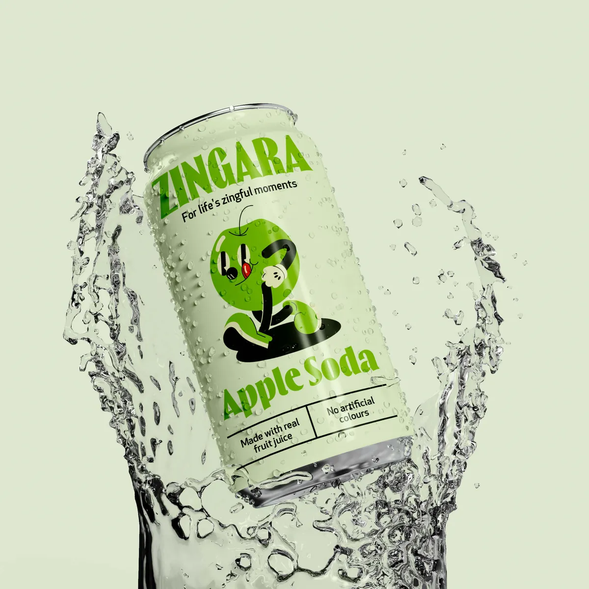


Being different is relatively easy. Make everything fluorescent. Turn the logo upside down. Put your product in a completely unexpected container. Congratulations. You're different.
But are you memorable? Are you recognisable? Does the design communicate anything meaningful about your brand? Does it make sense for your brand? Or are you just trying to be daft in order to be different?
These are questions you should ask yourself.
Effective creative packaging design needs to balance originality with purpose. It should interrupt expectations without confusing consumers. It should communicate personality without sacrificing clarity. It should create recognition rather than simply chasing attention.
That there is the difference between creative rebellion and creative chaos.
A distinctive packaging identity should:
Standing out for all the wrong reasons isn't necessarily a win. Nobody wants their product to become famous because customers can't work out what it is.


Fortunately, some brands have demonstrated that packaging doesn't need to follow the established category playbook. And the interesting thing is that they haven't all done it in the same way.
We rate this brand a lot!
Water has traditionally been marketed around purity, hydration and natural beauty, right? Well, thank god the whole category isn't one big snooze fest anymore, because Liquid Death decided to do things a little differently.
Rather than following the usual Evian-style approach, Liquid Death took inspiration from beer, heavy metal and alternative culture. Its tallboy cans, aggressive typography and rebellious personality look more like something you'd find at a rock concert than in the bottled water aisle.
And that's exactly the point.
The brand has reportedly reached a valuation of $1.4 billion, proving just how powerful it can be to challenge an entire category's conventions.
But there's something else we love about Liquid Death's branding. It appeals to an audience that's often overlooked when it comes to drinks marketing: sober and sober-curious people.
Think about it. You're at a gig, a festival or on a night out, and you don't fancy drinking alcohol. You grab a bottle of water and suddenly everyone's asking, "Why aren't you drinking?" or "Go on, just have one!"
We've all heard it.
Liquid Death helps change that experience. Its cans look right at home alongside beers and other alcoholic drinks, meaning people can enjoy water without feeling like they're standing out or having to explain themselves.
It's not pretending to be alcohol. It's making water feel like something you actually want to be seen drinking.
And that's what makes the branding so clever. Liquid Death hasn't reinvented water. It's reinvented how people perceive it, turning one of the most ordinary products imaginable into something with attitude, personality and a genuine cultural following.
Sometimes, the best way to stand out is to just completely ignore the rulebook altogether.

Image source: liquiddeath.com

Image source: liquiddeath.com
Traditional milk packaging design is … well, let's just say incredibly boring from our point of view. Practical, yes. Exciting? Not even close.
Milk doesn't necessarily need to fight for attention on the shelves. You pick blue, red or green depending on what you fancy, and that's that. We get why it's a category that hasn't seen much rebellion over the years. It sells just fine as it is.
But then there's Oatly, the oat milk brand that's managed to make alternative milk packaging genuinely interesting.
For starters, the typography is, shall we say, a little bit in your face. Big, bold lettering, unconventional layouts and copy that looks like it's having a conversation with you rather than trying to sell you something.
Despite how busy some of the packaging design looks, it's surprisingly readable. In fact, Oatly has managed to turn the entire carton into something worth reading. You could be sitting down having a brew, accidentally leave the oat milk out on the kitchen counter and find yourself reading the back of the carton five minutes later. Not because you need to know the nutritional information, but because the copy is actually entertaining.
And they’re not afraid to be a little different with their choice of slogans, like "It's like milk, but made for humans" to "Wow No Cow!". Oatly are happy to challenge the dairy industry conventions.
Rather than filling the packaging design with the usual corporate messaging, they've given the brand a proper personality. Packaging doesn't have to stop doing its job once somebody's bought the product. Oatly proves that even an everyday carton of oat milk can become a nice piece of brand communication. They're constantly expanding their range of products and their sizes to appeal to new buyers. Did someone say Matcha??!
Who knew reading the back of a milk carton could be so entertaining? Take a look 👀.
Premium chocolate often relies on elegant typography, dark colours and fairly minimal packaging. You know the sort. Something that looks like it belongs in a fancy chocolate shop, wrapped with a bow and where you're slightly scared to look at the prices.
But Tony's Chocolonely decided to go in a completely different direction. Its bright colours and oversized lettering make it almost impossible to miss on the shelves. There's nothing particularly subtle about it, and that's exactly why we love it.
But the clever branding goes much further than making chocolate look fun.
Tony's Chocolonely was founded with a mission to end exploitation in the cocoa industry, including child labour and forced labour. The brand wants to raise awareness of how unequally money and power are distributed throughout the chocolate supply chain, with cocoa farmers often receiving a disproportionately small share of the value.
And they've managed to communicate that message through the chocolate itself.
Ever noticed how most chocolate bars are divided into perfectly equal squares? Well, Tony's deliberately makes its pieces uneven. Some are considerably bigger than others, representing the inequality within the chocolate industry.
How bloody smart is that?
It's such a simple design decision, but it gives the product a story that people can actually see, experience and talk about. Even breaking off a piece of chocolate becomes an opportunity to communicate what the brand stands for.
When the product is connected to a meaningful brand story, it can really help communicate what a business believes in and why that matters. It’s clearly working for the brand.

Image source: uk.tonyschocolonely.com

Image source: uk.tonyschocolonely.com
Just because Liquid Death's rebellious identity works for water doesn't mean slapping aggressive typography onto another product will have the same effect.
That's the thing about distinctive packaging. It needs to make sense for the brand, not simply copy somebody else's idea of being different.
And there's another important lesson from Liquid Death's story: great branding doesn't automatically guarantee commercial success.
After launching in 2023, Liquid Death generated £2 million in UK sales in the year to September 2024. Sounds decent, right? Well, despite growing sales by 761%, it still didn't make the UK's top 30 water brands.
And the pricing probably didn't help. At one point, four 500ml cans would set you back £5.50 in Tesco, compared with just 80p for two litres of its own-brand water. That's quite the difference when you're essentially buying water.
By February 2025, Liquid Death had paused its UK operations, with the company pointing to changes in its production and international supply chain.
So, was the branding a failure? We wouldn't say so. It's still a mega example of how to challenge category conventions and create something genuinely distinctive. But it does prove an important point. Even the most rebellious packaging design needs the right pricing, distribution and market strategy behind it.

So how do brands challenge expectations without throwing commercial common sense out of the window?
Study the packaging around you.
In order to choose wisely, you should look at competitor colours, typography, layouts, materials and messaging.
Identify the visual patterns that appear repeatedly.
Which conventions help consumers understand the product? Which simply exist because everyone has become accustomed to them?
You can't challenge expectations effectively if you don't understand what those expectations are.
Once you've identified the patterns, start questioning them.
The goal isn't to reject every convention. It's to stop accepting them without thinking.
Your packaging should communicate something about your brand, not simply demonstrate that you've researched your competitors.
That means understanding your audience, positioning, personality and values. A strong brand positioning strategy gives creative decisions a reason to exist. Without it, packaging design risks becoming a collection of attractive ideas that don't quite add up to anything. And attractive ideas are surprisingly easy to copy FYI.
Once you've established a clear direction, give the creative work room to breathe.
Have fun with it and explore the packaging design world by looking at maybe unexpected colours, distinctive typography, expressive illustrations or even unusual packaging structures. This isn’t a free-for-all, make sure every decision earns its place still.
The best packaging breaks rules intentionally because it helps communicate something better.
A design that looks incredible on a presentation slide doesn't automatically work on a supermarket shelf. Who would've thought??!
Test packaging alongside competitors and don’t be afraid to ask for feedback. Feedback is so underrated at this point in your packaging design journey.
Check whether people can recognise the brand, understand the product and identify important information. Consider all the important practical requirements such as accessibility, production/design costs and packaging design functionality.
Prototyping in packaging design helps identify issues before a bold creative idea becomes an expensive production mistake. Remember, there's a big difference between taking a calculated risk and just crossing your fingers.


Somewhere along the way, too many brands started confusing fitting in with getting it right.
They looked at their competitors, identified the category conventions and built packaging that ticked all the expected boxes. The problem isn't that brands lack creativity. It's that too many are too afraid to use it.
They're worried about looking too different or stepping outside what consumers already know and recognise. And we find that quite sad :(.
When every brand makes those same decisions, we get the same result: a category full of products fighting for attention, all dressed up the same. And nobody really wins in that game. The brands that have been around longer will likely have the commercial advantage in this case.
At Noramble, we believe packaging design should be an opportunity to express your brand in a way that can’t be replicated.

At Noramble, we create bold, distinctive brand identities and packaging design that challenge the expected without losing sight of what makes a brand commercially effective.
If your packaging is starting to look a little too comfortable alongside the competition, perhaps it's time to question a few things.
Get in touch with Noramble today if you want a lil hand with your packaging design!


