
Packaging redesigns are funny things. Get one right and suddenly a product that’s been sitting quietly on a shelf starts elbowing its competitors out of the way. Get one wrong and customers start wondering where their favourite orange juice has gone.
The best packaging redesigns aren’t simply prettier versions of what came before. They solve a problem.
Maybe the brand isn’t getting noticed. Maybe customers don’t understand what makes the product different. Perhaps a once-distinctive identity has slowly become indistinguishable from the ten brands sitting beside it.
Whatever the reason, a successful packaging design case study usually has the same three ingredients: a clear problem, a considered redesign process, and measurable brand design results.
Here are some particularly good examples.


Who Gives A Crap had already done a fairly impressive job of making toilet roll entertaining.
But moving further into physical retail created a different challenge. Online, there’s space to explain the brand’s sustainability credentials, its brand personality and the fact it donates 50% of profits to help improve sanitation. In a supermarket, shoppers might give a pack a few seconds.
Working with Lyon & Lyon, the brand developed retail packaging designed to disrupt a category dominated by soft colours, fluffy imagery and fairly predictable toilet-roll conventions.
The answer wasn’t to become more serious. It was to become more unmistakably Who Gives A Crap: bold colour, patterns, humour and a much clearer information hierarchy.
The important lesson? Changing sales channels can change what your packaging design needs to do. A design built for DTC doesn’t automatically work when it lands three shelves down from Andrex.

Image source: lyon&lyon.co.uk
Icelandic Provisions had strong repeat purchases once people actually tried its Skyr. The problem was getting them to pick it up in the first place.
Rather than joining the dairy aisle's endless parade of white tubs, Turner Duckworth pushed the brand much further into its Icelandic heritage.
The redesign introduced a Viking longship brandmark, rune-inspired typography, woodcut-style illustrations and dramatically stronger colours across flavours. “Skyr” also became much more prominent, helping shoppers understand what they were buying.
And it worked. Designalytics reported that sales increased by 16% following the redesign.
That’s differentiation doing its actual job.

Image source: designanalytics.com
Sometimes a redesign becomes necessary because the market catches up.
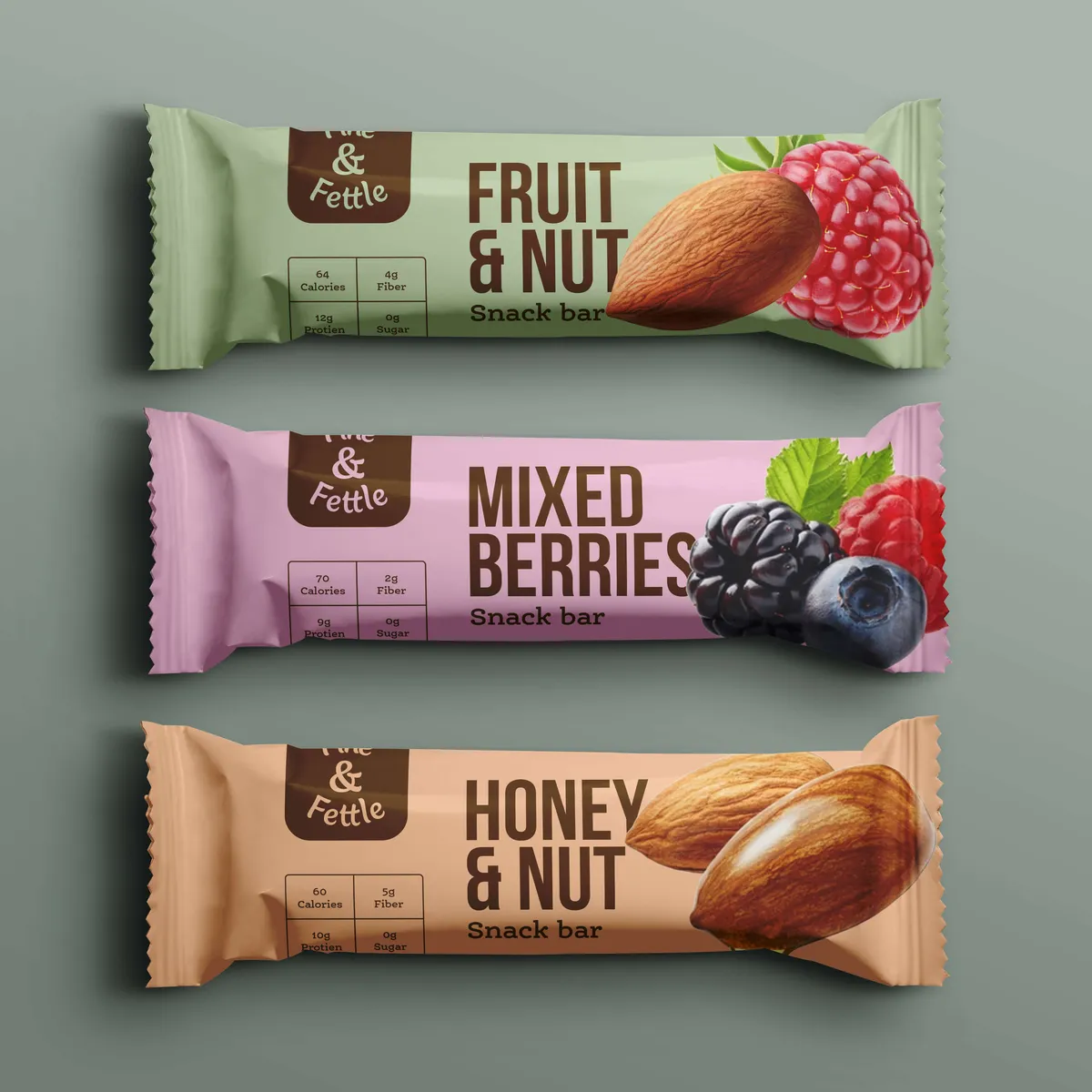
Fine & Fettle had held a strong position in its local snacking category, but new competitors were starting to eat into that territory. Noramble’s job was to rediscover what made the product appealing rather than chuck everything away and start again.
We pushed flavour and health higher up the hierarchy, increased colour saturation for greater shelf impact and introduced a more distinctive illustration style.
It’s an important distinction: a redesign doesn’t necessarily mean a full rebrand. Sometimes the foundations are perfectly good. They’ve just become a little buried.
Results?



Good redesign projects - from diagnosis through prototyping in the packaging design process – usually start somewhere less glamorous than picking fonts: finding out what’s actually wrong.
GoodPop’s old packaging design wasn't communicating strongly enough at shelf, so its redesign with Interact Brands focused on a few practical changes: stronger branding, greater consistency across the range, more appetising product photography and clearer front-of-pack claims.
Nothing revolutionary individually. Together, they transformed how quickly people could recognise the brand and understand the product.
The results were rather less subtle. Following the 2021 launch, sales grew 40% versus the previous year, while Designalytics research found 75% of category buyers preferred the new packaging.
It’s a brilliant example of why hierarchy matters. Packaging has dozens of things it could say. Successful packaging design decides what somebody needs to see first.

Image source: designanalytics.com
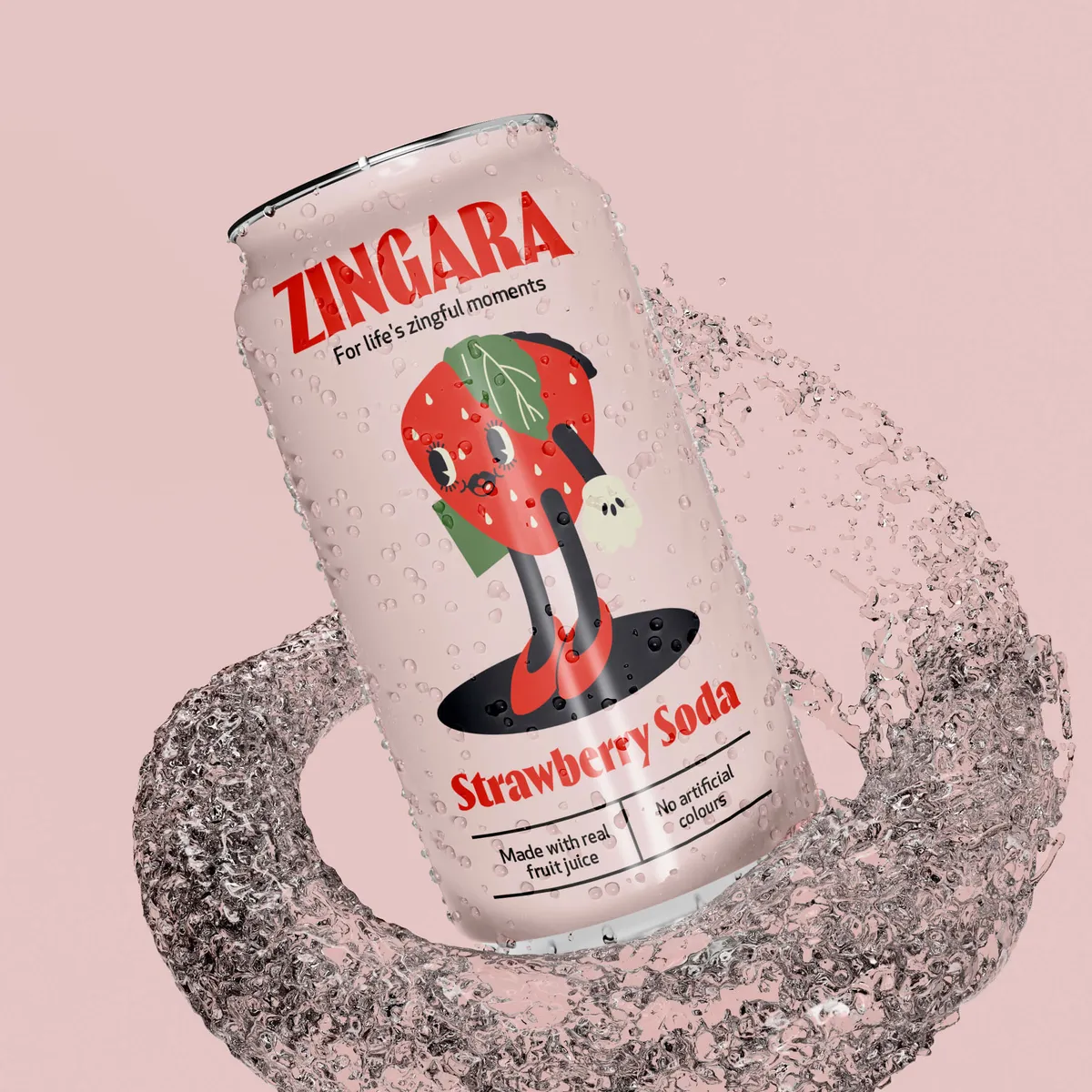
Teeth whitening has some extremely well-established category codes: clinical typography, pristine smiles and of course, the usual blue and white colour palette.
Flavadent had something more interesting to sell: flavoured teeth-whitening products.
Our redesign therefore made flavour impossible to miss. Bold colours differentiate the variants, typography became considerably more confident and we developed a mouth-and-teeth icon that could act as a recognisable brand asset.
The point wasn't to make the packaging weird for the sake of being weird. It was to identify the brand's strongest difference and give it the most visual weight.
If your USP is hiding in 9pt text somewhere near the barcode, you've probably got a hierarchy problem.


Packaging doesn't live exclusively on supermarket shelves anymore.
For Pick&Mix, Noramble developed a new pouch built around a distinctive split-colour treatment using the brand's core colours. It created something recognisable when photographed, held by customers, posted on social media or viewed as a tiny ecommerce thumbnail.
The back of the packaging design received just as much attention, with a clearer information hierarchy and a more considered visual system.
That's easily forgotten during the redesign process. The front might win the first purchase, but the entire packaging as a whole contributes to the experience afterwards.
Results?
This shows why it’s always good to get feedback on your packaging design.


The nicest thing somebody can say about new packaging isn't “that looks lovely”.
It's “sales went up” because brand design can impact sales in ways that aren't always immediately obvious.
GoodPop and Icelandic Provisions aren't isolated cases. Research has produced some fairly compelling examples.
After redesigning its packaging, plant-based ice cream brand NadaMoo! recorded 27% sales growth. Country Archer's redesign contributed to a 28% increase, while Hershey's packaging update was followed by growth of more than 9%.
Perhaps most interestingly, La Mexicana went from an 8% sales decline before its redesign to 15% growth afterwards, after strengthening distinctive brand assets and reorganising its communication hierarchy.
Different products. Different aesthetics. Similar principles: improve recognition, create stronger hierarchy and make the product easier to want.

Graza is worth mentioning because its packaging design shows where all of this can eventually lead.
Olive oil traditionally comes packaged in dark glass bottles covered in the language of heritage and provenance. Graza took another route: bright graphics, extremely straightforward naming and, most importantly, a green chef-style squeeze bottle.
That bottle became so closely associated with the brand that it effectively turned into advertising whenever it appeared in somebody's kitchen or social feed. Graza reportedly sold through its initial inventory within its first week, generating more than $100,000, and quickly expanded into major US retailers.
The interesting bit isn't “put olive oil in plastic”. It's that structural packaging can become a distinctive brand asset just as effectively as a logo or colour.

Image source: graza.co
No packaging redesign article would be complete without Tropicana.
In 2009, the brand replaced its familiar orange-with-a-straw imagery with a much more minimal design centred around a glass of orange juice.
Unfortunately, the redesign removed one of the strongest visual shortcuts customers used to recognise Tropicana.
Sales reportedly fell around 20%, and the old packaging returned just six weeks later.
There’s an important lesson hiding amongst all that orange juice.
One of the biggest packaging design mistakes is assuming that redesigning a brand means deleting everything people recognise about it.
Distinctive colours, shapes, illustrations, typography and structural elements build memory over time. Before removing one, you need to understand whether you're binning outdated decoration or throwing away something customers actively use to find you.

Image source: thebrandingjournal.com
Look across these packaging case studies and there isn't one visual formula for success. GoodPop increased appetite appeal. Icelandic Provisions leaned into provenance. Who Gives A Crap broke category conventions. Fine & Fettle changed its messaging hierarchy. Flavadent made its USP visual. Pick&Mix created a stronger, more consistent brand asset.
What connects them is brand strategy before styling.
A useful redesign starts by asking what the current packaging isn't doing well enough. Is it difficult to recognise? Does it disappear beside competitors? Is the USP unclear? Has the range become inconsistent? Does it work brilliantly online but fall apart in retail?
Answer that first and the design has something useful to solve.
Because packaging design is the advert people hold in their hands at exactly the moment they're deciding whether to buy.
And if yours is currently saying nothing while everybody around it is shouting, it might be time to give it something better to say.
As a packaging design agency, that's where we tend to start: understanding what's helping, what's getting in the way and what should be changed. At Noramble, we do all of that before anyone starts making things look pretty. If you're unsure which camp your packaging design falls into, get in touch with us to find out.


