
Packaging’s main function is to protect whatever is inside it, survive transport and make sense to customers on the shelf. But now it has a few other things to think about. Like looking good as a tiny ecommerce thumbnail, or giving someone useful information through the likes of a QR code. You might need to also consider how it will hold up during an unboxing video and explain what happens to it when the product is finished.
That makes the future of packaging design particularly interesting. Technology is opening up new ways for brands to communicate. Sustainability is affecting materials and structures from the start of the design process. At the same time, digital printing is making personalised packaging design far more achievable.
That said, there is a slightly unexpected counter-movement happening. As packaging becomes more digital, people seem far more drawn to packaging design that feels tactile and made by actual human beings.
So where is all this heading?
Rather than treating every emerging idea as a trend that brands need to immediately jump on, it is more useful to look at the bigger forces changing packaging and decide where they genuinely add value. This is all about figuring out what’s right for you and your brand.

One of the clearest future trends in packaging is the growing connection between the physical packaging and the digital world.
For years, packaging effectively stopped communicating once somebody had taken the product home. That boundary is disappearing fast.
Packaging can now act as an entry point to additional product information, recycling advice, authentication, recipes, tutorials or brand content. Used well, tech in packaging gives brands more space to communicate without filling every available millimetre of the physical design with tiny copy.
QR codes are probably the most obvious example.
They have gone from being a slightly awkward square that brands added because somebody in marketing thought they should, to becoming genuinely useful packaging infrastructure.
A QR code might take someone to ingredient information, explain where materials were sourced from or show the correct way to recycle the packaging. Food brands can link to serving suggestions. Beauty brands can offer tutorials on ‘how to use’. A premium product might use a code for authentication.
There is also a practical design benefit.
Information accessed digitally can often be updated without reprinting the packaging itself. That could reduce the need for printed leaflets and make it easier to provide detailed information without overwhelming the main pack.
GS1 is helping push this further through its work on 2D barcodes and GS1 Digital Link. This allows physical product identifiers to connect with online information and services. As retailers and supply chains adopt 2D barcode systems more widely, connected packaging is likely to become increasingly normal rather than something reserved for particularly techy brands.
We have looked in more detail at smart packaging and QR codes and how brands can build useful interactive packaging experiences.
Another development worth watching is the Digital Product Passport.
The EU's Ecodesign for Sustainable Products Regulation creates a framework for Digital Product Passports for relevant product categories. Depending on the product, these passports could make information about materials, manufacturing, repair, recycling and environmental performance easier to access.
That does not mean every packet of biscuits suddenly needs an enormous digital dossier attached to it. Requirements will vary by category and regulation.
What it does suggest is that packaging will increasingly act as the physical doorway to a much larger pool of product information.

QR codes are only one part of the story.
Augmented reality can turn relatively ordinary packaging into a full on interactive experience. You might see it on the likes of cosmetics packaging where it might trigger a virtual try-on. Or perhaps a food product will launch a recipe demonstration to make your life that little bit easier. A children's brand might build a game around the packaging itself to keep the kids amused.
Yes, we’re well aware that these ideas aren’t necessarily new, but the technology needed to use them has gotten better. Phones can handle more, online experiences are smoother, and people are now much more comfortable scanning codes or interacting with packaging digitally.
Here are four areas where technology could have the biggest effect on packaging:
Authentication has become particularly valuable in sectors where counterfeiting is a serious problem. We have previously explored how brands can combat counterfeiting through packaging.
Authentication can be particularly useful for products that are commonly counterfeited, especially when they're sold through marketplaces, resellers or third-party retailers. A unique QR code or digital identifier on the packaging can give buyers a simple way to check that the product came from the genuine brand. We have previously explored how brands can combat counterfeiting through packaging.
AI is likely to affect packaging design differently.
Packaging designer agencies can already use AI tools to explore visual directions, create early mock-ups, localise artwork and generate variations quickly. Over time, those systems will become more integrated into the normal packaging design process.
Let’s be clear though, this doesn't remove the need for designers by any means. It just changes where some of the time goes.
Generating twenty rough directions may become much faster. Deciding which direction actually fits the brand still requires judgement. So does understanding what feels distinctive within the sector, what communicates the right idea and what will still look credible in five years time.
The same applies when brands prototype new packaging concepts. Technology can speed up experimentation, but somebody still needs to decide whether the idea deserves to exist outside the mock-up.
The useful question is therefore less "Can we add technology to the packaging?" and more "Would this make the packaging design experience better and more accessible for the person using it?"
If the answer is no, a QR code probably isn’t necessary.

Sustainability has been influencing packaging for years, but the way brands approach it is changing.
Environmental considerations are increasingly being included at the concept stage, when decisions about materials, dimensions, structure and print methods can still be changed properly.
That is a much healthier approach than designing the dream pack first and attempting to sprinkle sustainability over it afterwards.
Consumer expectations are important here, but the picture is more nuanced than some sustainability headlines suggest.
McKinsey's 2025 global packaging research found that price and product quality remained stronger overall purchase drivers than environmental factors. These attitudes also varied significantly between markets and product categories.
That is useful context.
It means brands should be cautious about assuming consumers will happily accept a worse product experience or significantly higher price simply because the box is greener.
However, when consumers are specifically thinking about sustainable packaging, practical considerations such as recyclability can matter a great deal. McKinsey's US research found recyclability particularly important when respondents were asked about packaging sustainability.
That points towards a sensible direction for design: concentrate on improvements people can understand and actually use.
Materials and approaches likely to shape sustainable packaging include:
There is no universally perfect packaging material.
A paper-based structure can still be wasteful if it uses far more material than necessary. Glass in packaging design can feel premium and be widely recyclable while also being heavy to transport. Compostable packaging can be helpful in the right circumstances, but only where the necessary disposal route exists.
That is why choosing sustainable packaging materials requires looking at the complete system rather than choosing whichever material currently has the nicest environmental reputation.
For brands getting to grips with the subject, our guide to the basics of sustainable packaging is a useful starting point.


Some of the most interesting sustainable packaging ideas are less about swapping one material for another and more about changing what the pack is expected to do.
Refill systems are becoming much more visible, particularly across beauty, household and personal care. The idea is fairly straightforward: instead of replacing the entire pack every time, customers keep the main container and simply top it up or replace the bit that actually needs replacing.
We’ve seen this shift first-hand. When working on the packaging for Shift, we embraced its refill model and reworked the back of the packing to include a QR code linking directly to the brand’s sustainability mission. It gave people an easy way to understand the thinking behind the packaging without cramming an environmental essay onto the label.


Returnable packaging takes the idea one step further. Rather than asking customers to deal with the empty pack themselves, brands can create systems where packaging is collected, cleaned and put back into circulation.
It asks more of the supply chain, so it won’t make sense for every product. But where the logistics stack up, keeping the same packaging in use for longer can be far more interesting than endlessly producing replacements.
Then there’s the simple idea of making packaging too useful (or too nice) to immediately throw away.
Premium brands in particular are exploring packaging that has a life beyond the original product. A container might become storage, a bottle could be designed for refilling, or a presentation box could have an obvious second use.
There’s a nice brand benefit here too. If your packaging ends up living on someone’s dressing table rather than disappearing into the recycling five minutes after opening, your brand gets to hang around for a little longer.
Think about M&S – they introduced a light-up seasonal gin bottle for Christmas. This is likely something people will keep, even after the bottles empty.

Image source: prima.co.uk
Materials tend to get most of the attention in conversations about sustainable packaging, but the structure itself can make a surprisingly big difference.
Origami-inspired folds can reduce the need for glue. Clever locking mechanisms can remove separate components, while lightweighting can use less material without making the finished pack feel noticeably different.
Even tiny changes matter at scale. Shaving a few millimetres off a carton sounds about as exciting as watching one being folded, but multiply that saving across a few million packs and suddenly it becomes a much more meaningful reduction in material, transport space and waste.
This is where packaging designers need to work closely with converters, manufacturers and material suppliers. The earlier those conversations happen, the easier it is to reduce packaging waste without discovering late in the project that an apparently brilliant structure cannot actually be made at scale.
Regulation is applying additional pressure.
The EU Packaging and Packaging Waste Regulation (PPWR) entered into force on 11 February 2025 and generally applies from 12 August 2026. It covers areas including packaging composition, recyclability, reuse and waste prevention.
For brands selling into the EU, that makes sustainable packaging both a brand design and compliance issue rather than something that can sit entirely within the marketing department.

Packaging design is also having to communicate sustainability more carefully.
Consumers have heard "green", "natural" and "eco-friendly" enough times to know those words can mean almost anything.
Brands will need to provide proof and explain what they’ve actually changed.
That might involve stating the percentage of recycled content, identifying FSC-certified paper, clearly explaining local recycling routes or giving more information about how packaging is manufactured.
Certifications can help where they are relevant. We have covered some of the main sustainable packaging certifications and what they can communicate.
Digital packaging can support this too. Rather than turning the back panel into an essay about lifecycle analysis, a QR code could take interested customers to more detailed sourcing or environmental information.
Clear claims are likely to become part of the visual language of sustainable design.
And crucially, they need to be claims that a brand can stand behind and back up at any given moment.


Mass production has historically encouraged packaging to be almost identical. Take a walk down the cheese aisle and you’ll know what we mean. No differentiation. No one willing to rebel against the category.
Yes it makes economic sense when the most efficient production run involves printing hundreds of thousands of the same design.
But digital printing is changing that equation.
Personalised packaging can now vary between customers, audiences, locations, seasons or campaigns without requiring the same painful setup associated with traditional long production runs.
Personalised packaging has come a long way from simply sticking somebody’s name on a bottle. Although, to be fair, that worked very well for Coca-Cola.
Share a Coke is probably the example most people immediately think of. First launched in Australia in 2011 before reaching the UK in 2013, the campaign replaced the familiar Coca-Cola branding on bottles and cans with popular first names. Suddenly, finding your name (or hunting through the fridge for your mate’s) became part of buying a Coke.

Image source: coca-colacompany.com
It was a simple idea, and the numbers suggest people bought into it. Following the UK launch, Coca-Cola reportedly saw a 2.9% year-on-year increase in volume sales over the following three months. The campaign also picked up seven Cannes Lions awards.
More than a decade later, the idea is still going. Coca-Cola now lets customers order personalised cans and bottles online, with names and messages for occasions such as birthdays.
What makes the example interesting for the future of packaging is the thinking behind it. The physical product barely changed, but changing what appeared on the packaging gave people another reason to notice it, search for a particular version and share what they found.
Digital and variable-data printing are making that kind of variation much more accessible. Brands can create shorter runs where artwork, messages, locations or other elements change from one pack to the next, without needing an entirely separate packaging system for every version.
And don’t worry – you don't need Coca-Cola-sized budgets to make that interesting.

Image source: talkingretail.com
Variable-data printing can change individual elements within a consistent design system, allowing brands to create large numbers of related packs rather than one completely uniform design.
A personalised pack might vary:
The underlying identity can remain the same while individual packs feel different.
That creates endless possibilities for brands that previously had to choose between producing one universal pack or paying heavily for lots of smaller print runs.
Smithers estimates that the global digital print market for packaging and labels was worth around $22 billion in 2025 and forecasts growth to approximately $36.9 billion by 2030.
As digital printing gets better and easier to access, shorter print runs are becoming much more doable for brands.

The ability to create smaller runs also opens the door to more experimentation.
Brands can release seasonal packaging without committing to it permanently. Collaborations with artists can become limited editions. Regional products can feature artwork that actually relates to where they are sold.
That is where personalised packaging starts to overlap with collectability.
A numbered bottle or limited-run carton can feel more valuable because it belongs to a particular moment. A series of illustrations can encourage people to look for different versions. Packaging can become something people keep rather than something they immediately flatten and recycle.
Beauty, drinks, food, fashion and lifestyle brands are particularly well suited to this approach because appearance already plays a huge role in the product experience.
Seasonality is another obvious opportunity. Rather than changing the whole visual identity every December, brands can use adaptable design systems to create seasonal packaging design that feels fresh without becoming unrecognisable.
Personalisation can also work at a regional level.
Language, illustrations and cultural references can help packaging feel genuinely connected to a market. Our guide to packaging for different global markets goes into this in more detail.
There is an important caveat here.
Using local culture as decoration because it "looks interesting" can go wrong fairly quickly. Regional art, language and traditions work best when the connection is genuine and somebody has taken the time to understand what they are referencing.
Good personalisation makes the customer feel considered. At the same time, bad personalisation can send the wrong message entirely.

Image source: Wicked x Le Creuset
Technology and regulation may be changing how packaging works, but the visual side is becoming more interesting too.
There is no single look emerging as the packaging style of 2026.
If anything, some of the strongest packaging design trends 2026 are pulling in completely opposite directions.
That is probably a good thing.
Minimalism in packaging design is going nowhere, but the version of minimalism that dominates may continue to change.
Over the last decade, plenty of categories became filled with pale boxes, neat sans-serif fonts and extremely restrained branding.
Done well, that can feel confident.
Done badly, you end up with a shelf containing fifteen products that all look like they were designed by the same person. Not much shelf impact then is there?
The next phase is likely to be more purposeful.
Information hierarchy matters. Negative space still has value. Unnecessary graphics can disappear. But a simple pack needs enough character to be recognisable.
Materials can do some of that work.
An uncoated paper might create warmth. Embossing can add depth without adding another printed graphic. A specific typeface can become the main visual asset.
Industrial minimalism is another direction likely to continue growing, particularly in beauty, technology, wellness and homeware.
Think block-like forms, neutral colours, ergonomic structures and functional typography. Packaging starts to borrow cues from product and industrial design.
It can feel almost equipment-like.
Minimalism works particularly well when the restraint supports the brand rather than becoming the brand.


While some brands strip things back, others are doing almost the exact opposite.
Four visual directions are likely to coexist particularly comfortably:
Metallic finishes feel especially suited to the current moment.
AI and digital culture have made futuristic imagery familiar again, while aluminium and industrial materials also carry associations with durability and engineering.
A brand does not need to turn its entire packaging into a chrome spaceship to use the idea. Small reflective details or silver foils can provide enough contrast.
At the other end of the spectrum, handmade imperfection is gaining appeal because it gives brands another way to show personality. So much digital design can now be polished within an inch of its life.
Rough textures, uneven ink, hand-rendered illustration and stamping can make packaging feel more individual.
That human feeling could become even more valuable as AI-generated imagery becomes commonplace.
Heritage-inspired packaging is also likely to continue developing.
Apothecary layouts, engraving-style illustration and archival typography give brands an immediate sense of history. The trick is combining those references with enough contemporary detail. Our guide to vintage-inspired packaging design looks at how brands can use those references without disappearing completely into nostalgia.

Image source: Behance: Haig Club x Selfridges
Typography is also becoming increasingly central to packaging design.
For plenty of brands, type is replacing illustration or photography as the dominant visual feature.
Oversized lettering can make packaging visible in ecommerce thumbnails. Custom type can create recognisable, distinctive assets. Serif fonts can communicate heritage, while geometric sans-serifs can push a design in a more technical direction.
Handwriting can introduce informality and personality. Condensed type can turn long copy into a graphic element.
The role of typography in packaging is becoming particularly important because brands need recognisable systems that can adapt across physical and digital environments.
Editorial packaging fits into the same movement.
Instead of keeping the copy hidden on the back panel of the packaging design, brands are starting to treat words as part of the design itself.
Founder notes, production details, origin stories and even fairly long pieces of copy can create a slower interaction with the packaging.
Get this … the customer may actually stop to read it too. Imagine that.


Colour still needs to work on a physical shelf, but ecommerce has changed the job slightly.
Packaging design is often seen first as an image the size of a postage stamp.
That makes strong contrast seriously useful.
Bright gradients, neon details and unusual colour combinations can help a product remain identifiable at small sizes. Brands aimed at younger customers are particularly comfortable using more expressive palettes.
The important thing is ownership.
A colour trend becomes valuable when customers start associating the colour with the brand. Constantly changing palettes because a new shade is fashionable or ‘on trend’ currently can achieve the opposite.
Our guide to colour theory in packaging design covers some of the practical thinking behind those decisions.


A trend report can make packaging design sound suspiciously easy.
Add AI. Make it recyclable. Put something metallic on it. Throw in a QR code. Jobs a good’un.
Successful brands are slightly more complicated than that.
The most useful future trends are the ones that reinforce something the brand already wants to communicate.
A well-established brand should be very careful about sacrificing recognisable assets simply to look contemporary or cool. You know at Noramble we’re all for rebelling against the category but it has to make logical sense.
Customers notice familiar colours, shapes and type before they consciously analyse what the design is saying.
Those distinctive brand assets are valuable.
A heritage food brand might use digital printing to release regionally specific editions while keeping its core identity intact.
A modern skincare brand could introduce refillable packaging without abandoning the structural cues customers already recognise.
A challenger drinks brand could experiment with augmented reality if the experience fits its personality.
The trend is the tool.
But the brand is the thing people need to really remember.
This also means there is no requirement for the future of packaging to look futuristic.
A product using a 2D barcode, digital printing and advanced recycling technology could quite happily look handmade.
Likewise, a vintage-inspired bottle could hide a sophisticated authentication system behind a small QR code.
The most interesting packaging is often created when these apparent contradictions are allowed to coexist.


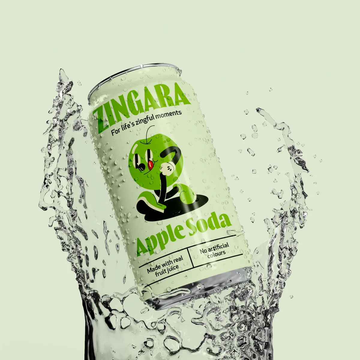

Packaging used to be judged primarily in physical retail.
Today, the same design might be seen in a supermarket, on Amazon, in an Instagram Reel and on somebody's kitchen counter.
That changes what designers need to think about.
| Design consideration | Physical retail | Ecommerce/social | Future priority |
| Colour and typography | Shelf recognition | Thumbnail visibility | Instant brand recognition |
| Structure | Handling and protection | Unboxing/shareability | Memorable interaction |
| Material | Tactile quality | Sustainability story | Circularity + sensory value |
| Digital layer | QR/verification | Shareable content | Ongoing brand engagement |
| Brand identity | Distinctiveness | Consistency | Trend-resistant recognition |
Structure is likely to become increasingly important within that mix.
Brands are already experimenting with curves, modular formats, unexpected folds and silhouettes that break established category conventions. It makes the unboxing experience much more memorable for a consumer.
A cleaning product might borrow visual cues from beauty. A drinks brand might use a container associated with an entirely different category. This resulting moment of confusion can make somebody look twice.
That kind of disruptive packaging works best when the joke is deliberate.
There is a reasonably narrow gap between "interesting anti-design" and "someone accidentally sent the printer the wrong file".
Unusual packaging structures can also create useful social moments.
If somebody wants to photograph the packaging, show how it opens or keep it on display, the packaging gains major exposure beyond the original purchase.
Before committing to something wildly different, though, test it.
Prototypes reveal problems that are invisible on screen. Customer feedback can tell you whether the supposedly disruptive idea is intriguing or simply confusing.
If there is one theme connecting many of these trends, it is the relationship between digital capability and human character.
There’s no question about it, packaging design technology will become more sophisticated over time.
AI will help teams work faster. Digital printing will give brands more freedom to create different versions of a pack. QR codes and Digital Product Passports will allow a relatively small piece of packaging to lead customers to far more information than could ever fit on the back of a box.
All of that is genuinely useful.
At exactly the same time, we think brands will work harder to make packaging feel human. And that’s the bit you can’t really replace.
We’re inevitably going to see brands trying to use AI to replace parts of the creative process because it’s quicker and cheaper. On a spreadsheet, that might look like an easy win. The problem comes when everyone has access to the same tools, producing the same imagery, following the same prompts and slowly sanding away all the quirks that made their brand recognisable in the first place.
Packaging design needs judgement. It needs ideas with a reason behind them. Sometimes it needs an experienced brand designer who knows when something feels too perfect, or a copywriter who writes something you’d never get past the first round of an AI prompt.
That human character could actually become more valuable as AI becomes commonplace.
We’re already seeing an appetite for hand-drawn illustration, rough textures, unusual typography, visible print imperfections and packaging design that feels like somebody has actually had a hand in making it. As perfectly crafted digital design becomes easier to produce, those little signs of personality have more chance of standing out.
That doesn’t mean brands should avoid AI or new technology. Far from it. Use AI to speed up repetitive jobs. Use digital printing to make production more flexible. Use QR codes when customers genuinely need more information. Technology is mega when it solves an actual problem.
But handing over your entire brand identity because a tool can produce 50 packaging concepts before lunch? We wouldn’t recommend it.
The interesting future sits somewhere between the two. Technology can make packaging smarter and production more efficient, while human thinking gives people a reason to care about the brand in the first place.
And as AI becomes easier for everyone to access, having an identity that feels unmistakably yours could end up being one of the biggest advantages a brand has. Especially in this day and age. Just some food for thought.

The temptation with any predictions article is to reach the end with a shopping list of things to add to your next redesign.
That is probably the wrong approach.
What should somebody understand when they pick up the product? Which assets already make the packaging recognisable? Where is the current packaging causing problems?
Once those questions are clear, design trends become much easier to evaluate.
If customers need more information than the packaging can comfortably hold, connected interactive packaging might help.
If sustainability targets require a reduction in materials, structural redesign could be more valuable than changing the graphics.
If a brand sells seasonal products or operates across several markets, variable-data printing could make personalisation useful.
If the existing packaging disappears completely in ecommerce thumbnails, a stronger type or colour system might make a bigger difference than an AR filter ever will.
Good packaging design has always involved editing.
The future will give brands more options, which makes that ability to edit even more important.

The future of packaging design will be shaped by several changes happening at once.
Packaging will become more connected through QR codes, Digital Product Passports and interactive experiences. AI will speed up parts of the creative process. Digital printing will make personalised packaging and shorter production runs more accessible.
Sustainability will influence materials, structures and production choices earlier in the process, while regulation such as the PPWR will push many brands towards more circular thinking.
Visually, there is unlikely to be one dominant answer.
Minimal packaging will exist alongside loud colour. Metallic futurism will sit next to vintage-inspired engraving. Highly automated design systems will produce packaging that deliberately looks handmade.
That variety is what makes the next few years interesting.
The brands that get the most from these future trends will be the ones that use them selectively. Useful innovation should improve the experience of the product, support environmental goals or strengthen brand recognition.
Trends are tools rather than replacements.
At the end of the day, the packaging design still needs to feel like you.
Planning to implement a new packaging design or wondering whether your current one needs a rethink? Get in touch with Noramble and we can help turn the useful bits of what's coming next into packaging that actually fits your brand.


